Showing posts with label Mike Harkins. Show all posts

Thursday 15 January 2015

Poster Project

It was last year when I discussed with Dan McCabe at University of Portsmouth about the idea of seeting a brief for the second year students on the BA (Hons) Graphic Design course. So in September, with some serious input from Dan, we set a brief to explore the relevance and role of the poster as a cultural artefact within the 21st Century.

Part of the brief runs as follows "The poster has a rich history within graphic design and has strong traditions in Europe. Its visual impact within the urban landscape is highly significant, and posters are considered by many as being visual barometers of social issues and attitudes. The purpose of the design was to celebrate and communicate the existence of the poster as a popular and prevalent cultural medium for the expression of ideas and beliefs. In other words, convince people of the power of the poster."

The design was stipulated to be an A2 size poster to reflect this brief and convey the power of the poster as a visual medium. After briefing the students, I received an email from Dan saying
"I briefed the project in yesterday, so we're up and running. They all looked a bit terrified"....so, an interesting start!

All the posters were to be A2 size and produced on our Redeem 100% Recycled 130gsm, ensuring a level playing field for the production of the finished pieces.

In November I went to see the results which were displayed in the Eldon gallery space:
The quality of entries was superb. The research and thought that had gone into the finished pieces was inspiring - truly a group of second year students with real talent. I was privileged to be asked to judge the entries together with the course teaching team; Dan McCabe, Mike Harkins, Estelle Taylor, Alex Tibus, Andrew Denham and course leader Sarah Houghton.
Following much deliberation, 18 posters were short-listed with 3 special commendations. For the week after the judging, the short-listed posters were put on display in the canteen gallery space.
There was an awards event in the canteen of the Eldon Building on the 8th December. Catherine Harper (Dean of the Cultural and Creative Industries faculty) presented the commended students with their awards on Fenner Paper's behalf.
The fantastic commendation award was designed and made as a collaboration between Senior Lecturer Dan McCabe and Principal Workshop Technician Michelle Littlewood and incorporates the Fenner Paper logo which has been laser cut out of 300gsm Redeem 100% Recycled!
Commendation awards being presented by Catherine Harper, Dean of the Cultural and Creative Industries faculty.
Dorsa Pedari
Kai Yik Chan & Wing Yung Wincy Kong
Another incentive for the students is that design of the overall winning poster is to be professionally litho printed as a poster and this distinction goes to Lucy Pittard for her 'Generation Poster'.
Lucy Pittard
Congratulations to all the shortlisted and commended students and thanks to all the staff for involving me in the project and making me so welcome.

The short-listed students are: Rhys Davies, Katie Hockley, Johannes Leismann, Gus Van Manen, Safiah Gheriani, Amie Lee Murphy, Dorsa Pedari, Simon Young, Shahad Milibari, Kai Yik Chan & Wing Yung Wincy Kong, Harry Lewis-Irlam, Zoe Fouracre, George Parry-Stoner, Ryan Robinson, Lucy Pittard, James Kelly, Yanne Moreira, Hannah Anderson and the three commended students are: Dorsa Pedari, Kai Yik Chan & Wing Yung Wincy Kong and Lucy Pittard.

 
Posted by Justin Hobson 15.01.2015


Friday 28 November 2014

UOP Showcase 2014

You may remember that back in the summer I went to New Designers exhibition, where I wrote about one of the students from Portsmouth University (Eric Downer) who was awarded the coveted "New Designer of the Year" title. http://justinsamazingworldatfennerpaper.blogspot.co.uk/2014/07/new-designers-2014.html  I also mentioned that the course showcase publication at the show was printed on our paper and that I would write about it at a later date ...well, here it is!
 
Size is 225x160mm, portrait and is perfect bound. It has a 4pp cover with a 64pp text and has a superb quality and feel about it ...and there a really clever little twist as well!
The covers, which are all printed just one colour - magenta- have been printed on five different colours of our Colorset, 100% Recycled. This is a wonderful 'print design' solution as maximises the impact and the processes used. It looks and feel like you are getting so much more out of a project, but a no extra cost!
All that is required to make this effective, is a design that will work printed in one colour, that can be applied successfully on a range of colours ...and this does just that, beautifully.
The text is printed on our Redeem 100% Recycled 130gsm which is printed beautifully and does great justice to the wide and varied work of the students. Being a neutral white it gives the publication a 'booky' feel which works really well with the imagery.
The catalogue design team is Andy Lethbridge, Ellie Taylor, Ali Bird and Eric Downer and they have done a superb job. The academic team is Sarah Houghton, Andrew Denham, Mike Harkins, Dan McCabe, Estelle Taylor, Alex Tibus.

...and below you can see the striking result of how the different colour covers look, all stacked up at the New Designers show:
Catalogue production and coordination was handled by Sarah Houghton, Course Leader at the University of Portsmouth. Printing is by PPG Print in Portsmouth.

www.port.ac.uk
http://www.ppgprint.co.uk/
Posted by Justin Hobson 28.11.2014

Wednesday 4 June 2014

University of Portsmouth Graduate Show 2014

Last week, I had a lovely surprise when I opened my post to find not one but four posters for the University of Portsmouth graduate show!

The invitations and posters for the show are designed by Michael Harkins who is not only senior Lecturer but is also the course leader of the MA Graphic Design course.

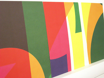
He kindly wrote a few words about the project for me: The posters represent part of a wider identity for the Faculty of Creative and Cultural Industries 2014 Graduate Show. This celebrates the opening of a new building allowing all four schools of the Faculty to be housed in single creative campus. The brief was to create a single identity that would unify, whilst retaining individual identity for each of the schools. The theme was based on ‘bringing together’. Initially a bespoke typeface was created consisting of four elemental parts. Each of the schools are represented by one of the geometric shapes. When combined form the identity SHOW 2014.
The posters are all A1 size (841x594mm) and are printed offset litho in CMYK on one side only. The paper used is our Redeem 100% Recycled 130gsm, which has a neutral white shade and recycled tone. Here they are on display in the Eldon building.
There are also four A5 invitations, mirroring the design on the posters, which are printed on Redeem 100% Recycled 315gsm
Printing is by L&S Printing who are based in Worthing. Thanks to Mike for sending file copies and his kind note
The show is open all this week at the Eldon Building at University of Portsmouth, ending on Friday 6th June, so you'd better get done there quickly!
Posted by Justin Hobson 04.06.2014

Wednesday 17 July 2013

Final Project - Matt Emmins

This is a project which I think is of interest, produced on our Offenbach Bible  A final major project for Matt Emmins at Portsmouth University and his description of the project is as follows:

"The project entitled '360' originated as a look into the use of circles in information design and whether they were a valid and viable way of showing data in a visual form. As the project developed it evolved into looking at 'the perfect circle' and whether it can be drawn freehand. This prompted me to test my own drawing abilities as well as my peers and lecturers to see who was more capable. I ended up collating a set of hand drawn circles which became a data set, that I began too use in an empirical research project. I aimed to discover patterns and trends in the way people draw circles. The outcome is a publication which houses the proposal and methodologies used, the data set, printed onto trace layers to allow for comparisons and finally the visual analysis which uses the circular form as its framework"


The project was printed digitally. The size is 1ft x 1ft when opened up so 1ft x 6inches (305x152mm in the real world!) when closed inspired by the size of isotype visualisation charts. The project is typeset in Futura light.

The Offenbach Bible 60gsm is 'French folded' and the project is perfect bound.

Matt's course lecturer at Portsmouth is Michael Harkins (who's appeared on this blog many times before). Among the various people listed in the credits on the back page are all the participants, Maaike van Neck and also ...me! Thanks to Matt for remembering to share with me and to thank us for supplying a small order of paper for this project.

www.mattemmins.com
www.port.ac.uk
Posted by Justin Hobson 17.07.2013

Thursday 30 May 2013

Summer Show 2013


Now is the time when many readers of this blog will be receiving invitations to degree shows from all corners of the country. Here is a particularly lovely and inspired example for the University of Portsmouth.
Below is the A1 poster (841x594mm) printed in CMYK, one side only, on Redeem 100% Recycled 130gsm.
...then to make the invitations, the material on the run was changed to Redeem 100% Recycled 315gsm and the run completed. The reverse of the board was then printed in one colour forming 16 x A5 invitations with CMYK on the reverse of the invite - a smart idea! 
Reverse of the A5 Invitations
The design is by  Michael Harkins, who is a senior Lecturer in Graphic Design and the course leader of the MA Graphic Design at the University of Portsmouth. Given the complexity of the design, I asked Mike to write some words to explain the project:

Often my work plays with complex ideas found within the design problem itself, yet this is something for the viewer to find within the work, not something obvious initially.

The idea really came from thinking about 2013 as a number in itself. For many people the date could be seen as a portentous one, unlucky, lucky, superstitious etc. This led me to think about what it is when we read into numbers as individuals, we often bring our own meanings/readings.

The numbers within the date are also the first in the sequence of natural, ordinal or cardinal numbers. 2013 is also the first time these numbers appear together in a year date since 1320, so quite special in that sense. They also form the idea of a countdown 3,2,1,0 to the show. As in the ordered sequence 0123, we arrive at 3, the number of years students commit to their degree programmes, culminating in the show.

So really the numbers become celebratory and playful. The use of the CMYK adds to this idea of playfulness in terms of interaction of form and colour. It also gets us, the viewer to bring about our own readings of the numbers. 

The invitations extend the playfulness by dividing the colour composition into 16 parts, each one producing a unique composition in itself, something we take time to view, enjoy, contemplate.
Posters on display behind glass

Printing is by L&S Printing based in Worthing, West Sussex and a beautiful job they've made of it.

...and thanks to Mike for sending me some file copies and a note (written on the printed reverse of the A5 invitation):
The preview is tomorrow evening at the Eldon Building at University of Portsmouth and the show is open from 3-14 June.

Posted by Justin Hobson 30.05.2013

Tuesday 29 May 2012

Portsmouth Summer Show 2012


I can truly describe this project as pure Gold! This is the poster and invitation to the forthcoming University of Portsmouth, 2012 Summer Show. There is an A1 (594x820mm) poster on Colorset Solar 120gsm and an invitation (297x105mm) on Colorset Solar 270gsm. Both items are hot foil blocked only (no print) in two colours (metallic gold and pigmented white foil).
The design is by Michael Harkins, who is a senior Lecturer in Graphic Design and the course leader of the MA Graphic Design at the University of Portsmouth and I asked Mike to write some words to explain the project:

"The poster and identity for this year's Summer Show ties together many themes, as is usual in the work I produce. Firstly the show is the high point in the academic year, it is also the month where the sun reaches its zenith (in this part of the world at least), additionally we often refer to this month as 'Golden June'. This nicely fits in with the idea of the 'Gold Standard', especially this year being an olympic one, so there is a cultural echo here in the identity. This is a time of year when students are showing their best work, not for the sake of winning but completing. The circle also reflects the last element in the University logo (originally designed by Banks and Miles). This can also be interpreted as completing – leaving the University with achievement. Thus, on the poster the names of the courses within the circle have completed at this point in terms of the show. The gold foil and terrifically sunny Colorset Solar, also help to give a feeling of celebration and opulence in these somewhat austere times. Although in ethical terms, the production and paper were actually a cheaper alternative to printing at this size in two colour litho. There is also less waste in terms of make ready etc. with regards to the paper"


The foil blocking was produced at Reflections print finishers in London. Mike mentioned that Bill Fletcher at Reflections deserves a special thank you, as the job was not an easy one to produce due to the huge area of foil on the poster - it does look absolutely stunning.

The private view is this Friday (1st June) and is open for general viewing on Wednesday 6th - Wednesday 13th June at the Eldon Building at University of Portsmouth - you should go and you may see something golden!
Posted by Justin Hobson 29.05.2012