Showing posts with label NB:Studio. Show all posts

Friday 20 November 2015

Creative Courage - A Lesson in Misdirection

Creative Courage is NB:Studio's mantra; a rallying cry, a touchstone, a catalyst. It’s also a platform for a series of talks, events and activities. Yesterday evening, I was invited to a Creative Courage talk at NB's Bankside studio which was being given by Simon Evans. Titled 'A lesson in Misdirection' , this wasn't just a talk, it was magic!

This is the fourth in the series of talks/events hosted by NB:Studio and it is a brilliant idea. These evening events stimulate new ideas, are great for staff, clients and suppliers alike and can bring a fresh perspective and thinking to a creative environment - in my opinion more studios should host events such as this.
Simon Evans was introduced by NB:Studio partner Nick Finney(above). Simon is a Theatre director, two time Close-up Magician of the year and National Theatre Magic Consultant amongst many other activities.
Click on images to enlarge
Simon gave his masterclass in 'misdirection' explaining how magicians make you look in the right place at the wrong time – or the wrong place at the right time! This was part lecture, part performance and mostly magic show!
It's given me some great ideas for shuffling swatches and making other paper companies sample books disappear - what an illusion that would be!

It was a magical evening and my thanks go to all at NB:Studio for inviting me and to Simon Evans for an extremely insightful talk and a wonderful performance.

http://www.creativecourage.co.uk/
http://www.nbstudio.co.uk/
http://www.the-department.co.uk/simon-evans/
Posted by Justin Hobson 20.11.2015

Tuesday 15 September 2015

Sign of the Times

Sign of the Times is an exhibition of designs from 100 of the world's great designers held last week at the Protein Gallery in London EC2.
Invitation hot foil blocked in two colours by Gavin Martin Colournet
on Neptune Unique 700gsm
NB:Studio, together with Spring Chicken and Michael Wolff, launched a competition to redesign the famous ‘elderly people’ road sign.
In NB's own words:
The ‘elderly people’ road sign - you probably know the one – it’s a depressing silhouette of a stooping elderly couple with a walking stick.

We feel this sign gives a derogatory and out-of-touch impression of older people that implies both frailty and disability. This has been picked up in recent months by the UK press and we feel it’s high time that the design community responded. So, we asked some of the best designers to create a new warning sign – a new icon – to make it easier for drivers to see that older adults may be crossing. And one that paints a more positive image of Britain’s older community.
 
The private view was held last Thursday evening and it was a very jolly party!
Click on images to enlarge
NB Studio received both serious and playful submissions from designers around the world. You can see all the entries here: http://www.creativecourage.co.uk/sign-of-the-times. The Huffington Post, Metro and The Daily Mail Online have covered the story. The ambition for the project is to lobby the UK’s Department for Transport into changing the sign and to raise further awareness of the issue. Amongst the many playful entries is this knitted road sign from The Partners (below)
Partner at NB:Studio, Alan Dye (below) gave the introduction and spoke eloquently about the project.
...and Michael Wolff was truly inspirational in his appeal to get designers involved and open their eyes to designing for the older generation.
The signs were supplied by Whybrow Wayfinding and they really are terrific. If you would like to own one, you can bid for it on the auction site: http://stores.ebay.co.uk/nbstudioshop with all proceeds raised going to Age UK.

...and you can also vote for your favourite here: http://www.springchicken.co.uk/signofthetimes/

Below is the book, which is printed on our StarFine, printed by Gavin Martin Colournet, which I will write about in a separate post.
It was a pleasure to be involved with the project and my thanks to everyone at NB:Studio and Gavin Martin Colournet, who put a huge amount of time and effort into making this a real success.

http://www.springchicken.co.uk/signofthetimes/
http://www.whybrow.co.uk/
www.nbstudio.co.uk
Posted by Justin Hobson 15.09.2015

Friday 17 April 2015

What is ...Greyboard?


What is ...Number 16
Regular followers of this blog will know that in the middle of the month, I publish a "What is ....? post. The article covers various aspects of paper, printing and finishing in greater depth. However, many of these subjects are complex, so these posts are only intended to be a brief introduction to the topic.

What is ...Greyboard?
Sounds obvious doesn't it? ..but Greyboard is something I get asked about quite a lot and I thought it was worth writing about.

These days, the term Greyboard is used to describe a low grade, 100% recycled, grey coloured thick board used for pad backing, rigid boxes, carton (not corrugated) toy packaging and bookbinding. The product 'greyboard' which is now manufactured has many forebears and the names of these products are sometimes still referred to. In particular, names which people often refer to are strawboard (it used to be made using cereal straw), unlined chipboard, millboard, container board, Dutch greyboard etc etc.

...and this is what it looks like:
Click on image to enlarge all images
Back 'in the day' Dutch Greyboard just came from Holland and was a superior product to the UK manufactured chipboards but nowadays the 'dutch' has been dropped and 'Greyboard' is the generic term used in the UK industry.

Although all paper and board is sold by price which is calculated by weight (grams per square meter - gsm) Greyboard and other boards are manufactured to a thickness or caliper, which is measured in microns, often referred to as mics or by the symbol ยต (classical Greek for the letter M)

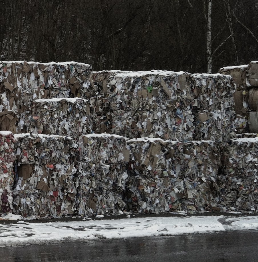
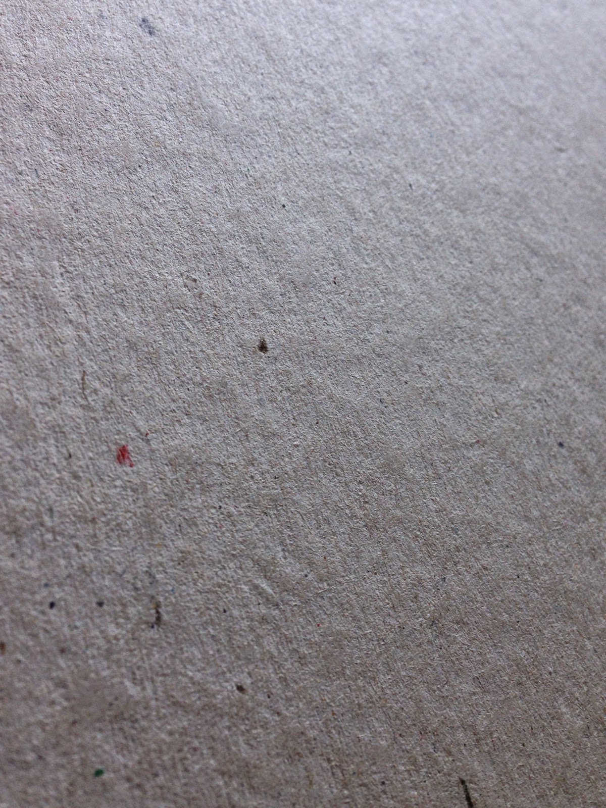
Many people want to use greyboard because it has a 'raw' unfinished appearance. It's also extremely cheap compared with virtually any other heavyweight/thick product and it is environmentally friendly, being made using the lowest grade recycled fibres (pictured left).
Greyboard can be used very effectively in a variety of ways including business cards, postcards and as covers, such as this RCA catalogue from 2004 - in this instance, it has been hot foil blocked in a clear foil with cloth tape running along the spine.
http://justinsamazingworldatfennerpaper.blogspot.co.uk/2011/02/jobs-from-past-number-16.html
As you can see this is a great result, however, be warned, there are a few issues about the product which is important to realise and I'm about to reveal what they are...
 
Firstly, the shade (colour) and surface is not consistent both from batch to batch and mill to mill. Below is an image of 1000 micron greyboard which I recently received from a board mill. The one on the left was the sample I received and the one on the right was a piece taken from the actual order we received - quite different in both shade and surface BUT they both measure 1000microns thick and that is about the only criteria that this product is made to.
click on image to enlarge
In a high volume, cost driven business, using a low quality 100% recycled fibre this is to be expected and is totally acceptable - so don't expect to send it back or be unhappy if it isn't quite the same as the sample you received!
Above is a set of samples of different weights from a supplier - the only thing you can say regarding consistency, is that there isn't any!
 
Click on image to enlarge
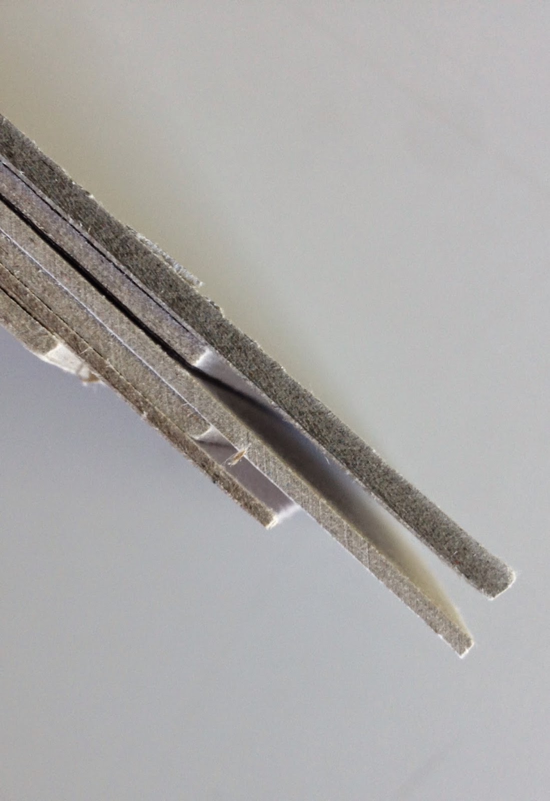
Generally speaking, the weight range of greyboard is from around 300gsm/500micron and goes up to around 1500gsm/3000micron, but as I mentioned previously the importance with this as a product, is it's thickness as you see in the image on the right, showing boards up to 3mm thick (3000microns)
Greyboard is not guaranteed for printing, certainly not offset litho printing. That is not to say that printers won't or can't print it but many printers are reluctant, as the manufacturing mills don't make any guarantee for the printability of the product and if it was to go wrong/cause a problem in the printing press, the mill would not cover any losses due to the product. The same can be said for hot foil blocking, it may work, but it may not and the risk/responsibility is all with the foiler and the designer.

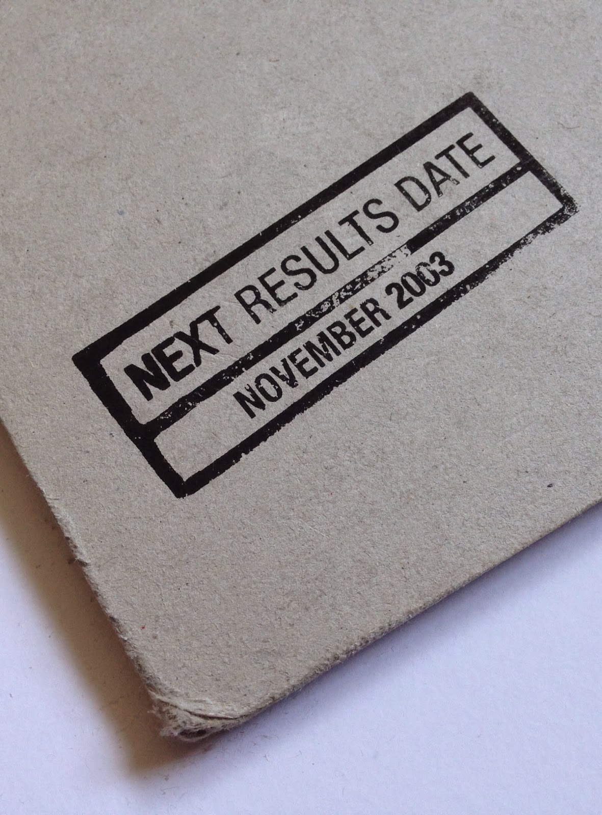
Another issue, is that because it is made with the lowest grade of waste, it is not guaranteed to be acid free, and can (not will) discolour and fade, as you can see in the picture below. 

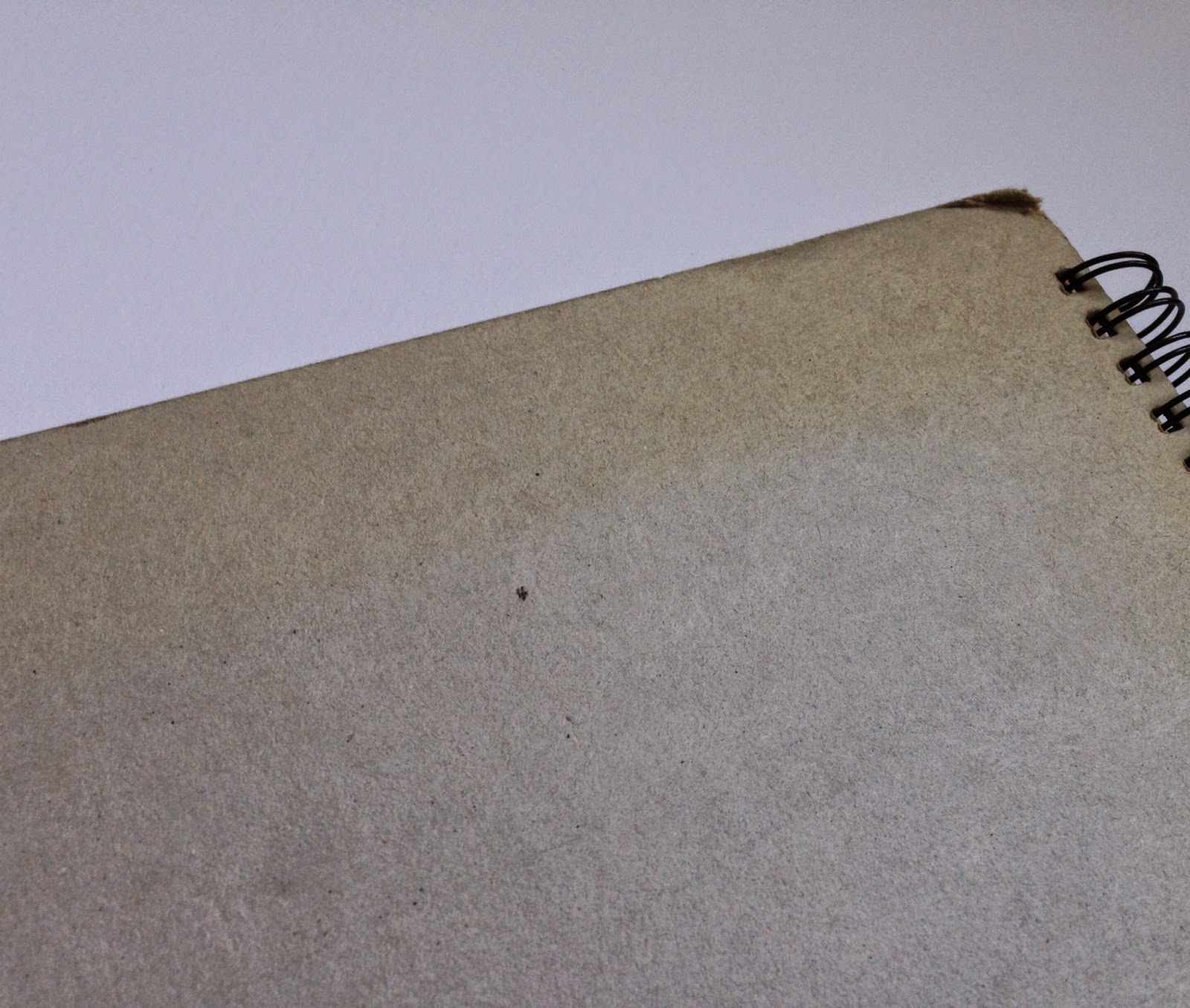
Because of it's unrefined, soft, fiberous nature, greyboard does not tend to wear well and will oftern "feather" along worn edges - this is where fibers  come loose along a cut edge. As you can see from the back cover of the annual report below (Speedy Hire Annual Report 2003, designed by NB:Studio for MerchantCantos) it does not wear well.
Click on image to enlarge

It might seem like I'm giving a doom and gloom report about this type of product and only writing negative things! Greyboard is a useful, cheap product and can be used in innovative, exciting and different ways and yes, people can revel in it's grungy appearance! BUT, many people (clients in particular) expect manufactured products to have a consistency (and almost a perfection!) to them, which this product just doesn't have. All I'm trying to do is draw people's attention to some of the product's shortcomings.

Another question I get asked is why is some greyboard called unpasted and some called pasted. Basically this refers to the manufacturing process. Unpasted greyboard is produced in a single ply and tends to be rougher, whereas pasted greyboard is produced in layers on the board machine and is almost always smoother - it is NOT duplexed like a paper can be, to make a thick board, it is produced on the board machine in multiple layers.
Like most areas of industry, there are many different grades of product available - superior quality for bookbinding or photographic mounting for example.

For interest, here is a link to a greyboard manufacturer in the US, but they still call it Chipboard over there! http://www.newmanpaperboard.com/#

Posted by Justin Hobson 17.04.2015

Thursday 8 January 2015

The Story of Fundraising

More Partnership are experts in philanthropic fundraising. They help organisations which are typically charities, universities, museums and schools to be more effective in raising money. As the title of this book reveals, it is about stories, which as they say in the introduction, lie at the heart of persuasive fundraising.
The size of the book is 150mm square, which is a friendly and manageable size. The cover only contains a modest 24pp text (saddle stitched) but to make this more a more substantial piece of literature, it has our Kemikal Cotton White 1500microns mounted to the front and back cover. The spine has been left exposed by 15mm on the front and back cover as can be seen in the picture below.
The cover is on Colorset, 270gsm (100% Recycled) and the 24pp text is printed four colour offset litho and printed on our StarFine Natural White 150gsm.The text paper was chosen because it is a neutral white, uncoated paper, which works in harmony with the cover materials and the beautiful illustrations by Jenny Bowers (Peep Show Collective) which run throughout the book.
There are four different Colorset colours used - just by simply changing the colour of the board used, it suddenly makes a series!
The outside covers are simply silkscreened in one colour black. It works just beautifully on the Kemikal Cotton White which is 1.5mm thick!
The below picture shows the foredge and the overall thickness which is 6mm.
Design is by NB:Studio, where the Creative Directors are Nick Finney and Alan Dye. Designer on the project is Kirsty Whittaker.
 
It has been beautifully printed, silkscreened and finished by Absolute Ink who are based in East London. The cover was silkscreened by Bob Eight Pop, who are part of the Absolute Group.
 
Posted by Justin Hobson 08.01.2015

Tuesday 17 July 2012

Penthouse - Wellington House

Wellington House in Buckingham Gate, London SW1 is one of London's most prestigious addresses. This is the literature especially commissioned to sell the penthouse appartment (which, incidentally, comes with the roof terrace!)

The cover which is litho printed with leaf illustrations and hot foil blocked in silver and white foil uses a linen embossed brown board supplied by that other, Hull based, paper company! Size is 190x265mm portrait and is saddle stitched.
However, it's the text where the job really starts to shine! ...printed on our Omnia 150gsm.
Centre spread:
Interestingly, the brochure only has a 4pp text stitched in, with the 6pp "plans" section forming a roll fold which has been stuck into the inside back cover using a tab stuck parallel to the spine (below)

...rolling out to it's full extent:


Design is by NB:Studio. Creative Directors on the project were Nick Finney and Alan Dye. Designer was Eng Su. It has been beautifully printed, foiled and finished by Gavin Martin.

Posted by Justin Hobson 17.07.2012

Friday 2 December 2011

Jobs from the past - Number 26

Regular followers of this blog will know that my first post of every month is a "job from the past" so that I can show some of the really good work from years gone by...

D&AD Membership Campaign
August 2006

Having introduced several new membership categories, D&AD appointed NB to produce a comprehensive promotional campaign. In NB's own words: "To appeal to the target audience – the creative industries – we opted for clarity and wit. Using objects commonly found in creative environments and items related to specific membership benefits, we created collage set pieces which were photographed by John Ross. Striking, cohesive and cost effective, the campaign launched with a fold out poster."

The A1 posters which folded down to A5 were printed on Offenbach Bible in 60gsm because at this weight (and if folded correctly - i.e. concertina and concertina, therefore allowing all air to escape) there are no "crows feet" appearing - if you're not familiar with that term, it's where a rather ugly crease appears crinkled from the centre of the fold, splaying out like the bird's foot.


Creative Directors on the project were Nick Finney Ben Stott and Alan Dye. Designer was Eng Su.

It was printed and finished by Pureprint (48,000 copies, as I recall). Pureprint were the print sposnor of D&AD at that time.
Posted by Justin Hobson 02.12.2011

Thursday 24 March 2011

Oxford Thinking

Here's yet another one of the pieces shortlisted  for the DesignWeek awards the other week. Designed by NB:Studio in collaboration with Michael Wolff, this piece of literature relaunched the University of Oxford's fundraising campaign report. In the Designweek awards brochure the job was described as "a fresh, modest and quirky editorial style captures the spirit of the university - with the report raising £250,000 in the first two weeks alone"
Size is A4 portrait (you don't often see that on this blog!), endorsement folded to A5. It is a 12pp self cover printed on Redeem 100% Recycled 70gsm which gives it a light newspapery feel, but as you can see from the images below, it has really worked well with the photography.  
The centre 4pp which deals with the money aspect of the publication has been printed with an overall solid "wash" of a Financial Times pink colour and features as more of a supplement.
Sadly it's didn't win the category it was shortlisted for (direct mail) but happily for NB, they won the award anyway for another job they did! (called: This Year 2010)  However it wasn't on our paper, so I'm not going to write about it! haha!

Design is by NB:Studio and Michael Wolff
Print is by Gavin Martin
Posted by Justin Hobson 24.03.2011

Tuesday 4 January 2011

Jobs from the past - Number 15

Happy New Year!

Followers of this blog will know that my first post of every month is a "job from the past" so that I can show some of the really good work from years gone by. ...here's the first post for 2011.

Merchant Handbook - 2002

Merchant is the corporate reporting arm of global PR firm Brunswick. In the 1990's years they used to produce a report called the Merchant Handbook, showing FTSE listed companies and which agency did their reporting and who printed it etc. - it used to be quite interesting reading. By the 2000's the burden of collating this information was too great and the Merchant Handbook became a yearly publication of relevant articles about reporting, CSR and investor relations.

At that time Merchant managed the production and design and used a collection of independent studios to do the creative work. This report was designed by NB:Studio.

The report contains articles on six different subjects and each one forms it's own booklet. Each booklet is designed in a completely different style, either purely typographic, illustrative image based etc. and to emphasise the difference, each booklet is on a different material. Some are printed CMYK, some 2 colour and 1 colour plus silkscreen.
Each individual booklet was saddle stitched and they were then 'double-sided' to each other (back to front covers) along the spines only allowing each booklet to open freely but giving the appearance of a neatly stacked pile of different booklets from the front. The overall size of the job is 225x280mm portrait (cover size) with a 14mm spine.

The materials used were Episiode IV 115gsm, Alga Carta 90gsm, Millennium Real Art 170gsm, Dali Neve 160gsm, Neptune Unique 135gsm, Appledawn Cream Velvet 150gsm, some of which are now defunct.

One of the crucial factors that contibuted to the success of the job was the selection of the board for the cover. Being a 4pp cover but with a parallel creased 'freestanding' spine and all the weight being stuck into the inside back cover, it needed to be a substantial piece of board. Our Aerographic Twin 500gsm was used with a gloss lamination on the outside cover and it really works.
Creative directors on the project at NB: Studio were the three partners (Nick, Ben and Alan) and the designer was Nick Vincent. This is just a lovely piece of printed literature - it is extremely engaging. However from memory I don't think it was nominated or won any awards which was a shame and a bit of a surprise. The  2003 Handbook (also designed by NB) was nominated for illustration at D&AD and was also on our paper, so maybe I'll write about that some other time!

The publication was produced under Managing Director, Robert Moser's watchful eyes and the project was managed by Leonie Dixon. Russell Thompson oversaw the print production and finishing (most importantly) of the job which was printed by Impressions in Wimbledon, who (like many printers from that era) don't exist anymore.

So where are they all now? Russell Thompson is production director at Merchant, Nick and Alan remain at the eponymous NB:Studio (http://www.nbstudio.co.uk/), Ben Stott now works independently on his own projects (http://www.benstott.com/) and  Nick Vincent set up his own studio (http://www.vincentdesign.co.uk/) ...oh, and I'm still at Fenner Paper!

Posted by Justin Hobson 04.01.2011