Showing posts with label Sandra Zellmer. Show all posts

Thursday 9 February 2023

Matt Russell Photographer

Matt Russell is a London-based photographer specialising in food, travel, lifestyle and portraiture. With a strong reputation for his natural style and ability to capture life, Matt has established himself internationally as a trusted, reputable photographer. He has an inherent ability to work closely with clients to achieve their vision for both editorial and advertising.
“I absolutely love my job and the places that it takes me, not to mention the amazingly talented and passionate people that I get to work with everyday. I feel incredibly privileged.”
This 40pp portfolio shows Matt's wide ranging photography skills in one superbly produced package. The size is 285x225mm (a good economical size out of a B1 sheet)
Click on images to enlarge
It has a 40pp text printed on our Omnia 120gsm. For those readers not familiar with Omnia, it is an uncoated paper with a surface treatment. What this means is that it feels like an uncoated paper but because the surface treatment minimises 'dot-gain', the print result is much more like that of a coated silk or gloss coated paper.
Centre spread...
There are so many good images here which look so good, that it's hard not to show you every spread!
The publication is printed offset litho throughout in CMYK. As you can see from images, some of the images are quite dark, but there is no loss of detail, which is what can often happen printing on a true uncoated paper. As you can see from the detail image below, the reproduction is simply stunning.
The brochure is saddle stitched and even though Omnia is a very bulky paper, even with 40pp the spine looks good and doesn't "gape" in the middle, as you can see below.
Another lovely feature is the use of copper wire stitches. Just another lovely touch which makes this publication superb
Design is by Sandra Zellmer. Printing is by Ambrose Press. Jonathan Savory handled the project. Particular care has been taken over the repro - as with all projects for photographers, there is detail in the images which can only be truly appreciated by the photographer and it is the skill of the printer to be able to listen and interpret these comments in the finished printed job. Not always easy to do but this is a beautiful piece of printed literature.

https://mattrussell.co.uk
http://www.sandraswork.com/
http://www.ambrosepress.co.uk/
Posted by Justin Hobson 09.02.2023

Thursday 11 June 2020

Invitation to Void

Presented as part of last year's London Design Festival, VOID is an installation by photographer Dan Tobin Smith and creative studio The Experience Machine, a multi-sensory spatial installation at Collins Music Hall, Islington.
A selection of Mozambican rubies and Zambian emeralds from their supporter Gemfields’ mines, which date back millions of years, were brought to life through photography of tiny microcosms magnified to become abstract, galaxy-like structures.
Click on images to enlarge
This is the beautifully produced private view invitation. Size is A5 landscape (148x210mm). The invitation face is is printed on our Colorset, Dark Grey 270gsm, heavily debossed (see above) and hot foil blocked in metallic black foil. Below, shows the detail of the hot foil blocking 
The invitation is triplexed, with the Colorset Dark Grey on the face, our Sumo Black 1.5mm in the centre and a HP Indigo printed reverse, giving an overall thickness of 2mm.
Different images from the installation were used on the reverse of the invitations, the below image shows two of the images...
Design is by Sandra Zellmer. The superlative print and finishing is by Brighton based Generation Press, who are unusual in having litho, digital, letterpress and hot-foiling all in house.

https://www.londondesignfestival.com/event/void
https://gemfields.com/
http://www.sandrazellmer.com/
https://generationpress.co.uk/
Posted by Justin Hobson 11.06.2020

Friday 17 January 2020

Lightboxes and Lettering

Yesterday, on a cold wet evening I went to the opening of a new exhibition at the Nunnery Gallery in Bow. Lightboxes and Lettering is the culmination of a project about the heritage of the printing industry in East London. Made possible by money raised by National Lottery players, the project focuses on the pre-digital era of printing in Hackney, Tower Hamlets and Waltham Forest and the experiences of people involved in the industry. The project explores how the printing industry has changed with the arrival of digital technologies, and how newer processes have transformed the everyday lives of print workers.

Printing – including lithography, silkscreen, and letterpress – has been an important industry in east London for many years. Access to small presses allowed political and community groups to easily print their books, pamphlets and leaflets, and many of these smaller firms were in east London. In recent years, the industry has changed a great deal, with the number of print workshops now much reduced and those in operation working in very different ways to how they would have done just a few decades ago.
The project maps former businesses, records the experiences of current and former employees, and shows collected printed matter, images of print workshops and details of technical processes.
This is a well researched exhibition and the project is documented in a catalogue (below) printed on Colorset, Shiro Echo and a map printed on our Offenbach Bible. It is printed by Aldgate Press, one of the East London printers featured in the exhibition and designed by Sandra Zellmer.  I'll write about the catalogue another time.
Congratulations to Lucy Harrison and Rosa Ainley from Rendezvous Projects who put the project and the exhibition together. The exhibition runs until 29th March and is at the Nunnery Gallery in Bow Road E3. It is an excellent exhibition and well worth a visit.

http://www.lightboxeslettering.com/
https://bowarts.org/nunnery
Posted by Justin Hobson 17.01.2020

Friday 27 September 2019

Matt Russell Portfolio

Matt Russell is a London-based photographer specialising in food, travel, lifestyle and portraiture. With a strong reputation for his natural style and ability to capture life, Matt has established himself internationally as a trusted, reputable photographer. He has an inherent ability to work closely with clients to achieve their vision for both editorial and advertising.
“I absolutely love my job and the places that it takes me, not to mention the amazingly talented and passionate people that I get to work with everyday. I feel incredibly privileged.”
This 40pp portfolio shows Matt's wide ranging photography skills in one superbly produced package. The size is 285x225mm (a good economical size out of a B1 sheet)
Click on images to enlarge
It has a 40pp text printed on our Omnia 120gsm. For those readers not familiar with Omnia, it is an uncoated paper with a surface treatment. What this means is that it feels like an uncoated paper but because the surface treatment minimises 'dot-gain', the print result is much more like that of a coated silk or gloss coated paper.
Centre spread...
There are so many good images here which look so good, that it's hard not to show you every spread!
The publication is printed offset litho throughout in CMYK. As you can see from images, some of the images are quite dark, but there is no loss of detail, which is what can often happen printing on a true uncoated paper. As you can see from the detail image below, the reproduction is simply stunning.
The brochure is saddle stitched and even though Omnia is a very bulky paper, even with 40pp the spine looks good and doesn't "gape" in the middle, as you can see below.
Another lovely feature is the use of copper wire stitches. Just another lovely touch which makes this publication superb
Design is by Sandra Zellmer. Printing is by Ambrose Press. Jonathan Savory handled the project. Particular care has been taken over the repro - as with all projects for photographers, there is detail in the images which can only be truly appreciated by the photographer and it is the skill of the printer to be able to listen and interpret these comments in the finished printed job. Not always easy to do but this is a beautiful piece of printed literature.

https://mattrussell.co.uk
http://www.sandraswork.com/
http://www.ambrosepress.co.uk/
Posted by Justin Hobson 27.09.2019

Friday 23 September 2016

UOP BA Hons 2016


Some readers may remember that back in the summer I went to New Designers exhibition, I also mentioned that the UOP course showcase publication which was piled up at the show was printed on our paper and that I would write about it at a later date ...well, here it is!

Size is 240x130mm, portrait and is perfect bound. It has a 4pp cover with a 64pp text and has a quality look and feel. The cover is printed (offset litho) in a stunningly bright fluorescent green which just pops off the paper!
...and as I hope you can see from the image below, the cover has been beautifully hot foil blocked in a white gloss foil.
The paper used is our Starfine White, which is an uncoated paper with a tactile feel. The cover is printed on 240gsm and the text is printed offset litho in CMYK throughout on 115gsm. This paper paper has excellent opacity for it's weight.
www.joshuaboughtondesign.com
Here are just some of my favourite spreads...
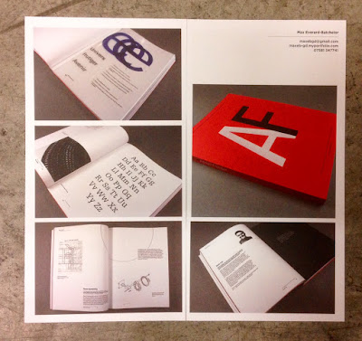
www.maxeb-gd.myportfolio.com
www.zoefouracredesign.tumblr.com
From the New Designers show, I particularly remember Thomas Mcleod's project Top Five most visited underground stations:
www.tmcleod.squarespace.com
www.dorsapedaridesign.tumblr.com
As well as showing the work of the students, it shows some insights into the life and times on the course. the spread below shows the trip to Berlin:
...and the annual charity pub quiz below...
Below is the credits page on the inside back cover:
 
The 64pp text gives the publication a 6mm spine:
The catalogue design team is Harry Lewis-Irlam and Ryan Robinson. Print is by Bishop Printers in Portsmouth, who have made an excellent job of the print production.

The academic team is Sarah Houghton, Andrew Denham, Mike Harkins, Dan McCabe, Estelle Taylor, Sandra Zellmer, Michael Wamposzyc.

www.portsmouthgraphicdesign.co.uk
http://bishops.co.uk/
http://www.port.ac.uk/
Posted by Justin Hobson 23.09.2016