Showing posts with label Sonya Dyakova. Show all posts

Monday 26 July 2021

Resonance 1

The Wapping Project is the creation of the Women's Playhouse Trust which was set up in 1981.

Throughout the 80s and the early 90s WPT’s artistic policy was defined by the playwrights it commissioned, produced and published, predominantly at the Royal Court Theatre, London. In 1993 it began to mount work in one of London’s most beautiful, derelict buildings in the East End, the Wapping Hydraulic Power Station; it is at this point that it became known as The Wapping Project, and established a worldwide reputation. It was always described by its founder and director, Jules Wright, as an idea consistently in transition. I have written about projects from this period on this blog before.

This publication titled 'Resonance 1' features an essay by Gareth Evans together with images by Berlin based photographer Karen Stuke.
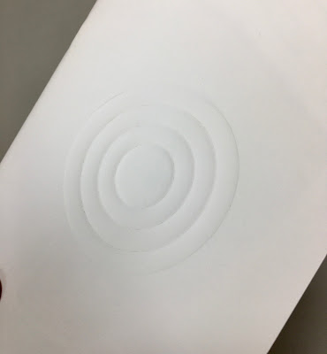
Size is 210x148mm (A5) portrait and is saddle stitched. The 4pp cover is printed on Astralux 1 sided 'cast coated' board, which is high gloss one side and uncoated reverse. The cover is debossed and hot foil blocked. The deboss on the front cover just draws you in... 
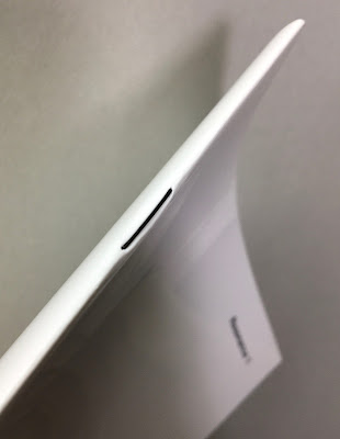
The below image is taken against the light, so you can see the high gloss...
The 48pp text is printed on our Offenbach Bible 60gsm, which works beautifully. The publication is mainly text but these images by Karen Stuke are large format pinhole images that follow the journey of a Jewish child brought on a Kindertransport from Prague.
For interest the above right hand page is backed up by the image below, which demonstrates the excellent opacity. 
Printed offset litho in CMYK, the 48pp text flops and flows beautifully in the hand... 
Mono image used for the centre spread
You can see the black wire used for the staples in this image and you can see them on the outside in the below image. It's a superb detail, a small touch, which works with the hot foil blocking in gloss black foil and makes all the difference.
Using the Offenbach Bible 60gsm means that the total thickness of the 48pp is only 2mm!
Design is by Atelier Dyakova and the creative director is Sonya Dyakova. Printing is by Push and the printing on our Offenbach Bible 60gsm and the finishing is superb. 

Posted by Justin Hobson 26.07.2021

Thursday 11 March 2021

Passage

 The Wapping Project is the creation of the Women's Playhouse Trust which was set up in 1981.

Throughout the 80s and the early 90s WPT’s artistic policy was defined by the playwrights it commissioned, produced and published, predominantly at the Royal Court Theatre, London. In 1993 it began to mount work in one of London’s most beautiful, derelict buildings in the East End, the Wapping Hydraulic Power Station; it is at this point that it became known as The Wapping Project, and established a worldwide reputation. It was always described by its founder and director, Jules Wright, as an idea consistently in transition. I have written about projects from this period on this blog before.

This publication titled 'Passage' follows two previous works 'Passage 2013' and 'Passage 1996' It features three pieces of poetry responding to the theme passageby Agnieszka Studzinska, Alia Syed and Heather Phillipson.
Click on images to enlarge
Size is 210x148mm (A5) portrait and is saddle stitched. The 4pp cover is hot foil blocked with a large solid panel in red foil (and on back cover). The 48pp text is printed on our Offenbach Bible 60gsm, which works beautifully. The publication is mainly text but the striking design uses the 'show through' to create amazing overlaying patterns.
Click on images to enlarge
Printed offset litho in two colours, the 48pp text flops and flows beautifully in the hand...
Click on images to enlarge
There are some images to support the text, which are all printed as monotones...
...and there is one double page spread, which is a full out image, which looks fantastic.
Using the Offenbach Bible 60gsm means that the total thickness of the 48pp is only 2mm!
Superb detail is the black coloured wire stitching (staples) a small touch, which makes all the difference. Published in an edition of 600.
Design is by Atelier Dyakova and the creative director is Sonya Dyakova. Printing is by Push and the printing on our Offenbach Bible 60gsm and the finishing is superb. 

Posted by Justin Hobson 11.03.2021 

Wednesday 2 September 2015

Jobs from the past - Number 71

Regular followers of this blog will know that my first post of every month is a "job from the past" so that I can show some of the really good work from years gone by...

The Wapping Project - 2000
The Wapping Project was, until recently, an arts project housed in the old Wapping Hydraulic Power Station (built 1890). The building originally housed steam operated boilers to generate electricity in the early days of electrification. The works was decommissioned and mothballed in 1977. The building was converted and reopened by the Womens Playhouse Trust (WPT) which is a charity and under the management of Jules Wright, it was opened as an arts centre in October 2000.
Click on images to enlarge
The project included exhibition space in the basement and SHED54, where pieces of original equipment were still in place. On 14th October the bar and restaurant WAPPING FOOD was opened, unusually with an all Australian wine list!

This is the promotional concertina folded leaflet, produced to give the information about events and exhibitions. Size is 225x696mm folding down to a finished size of 225x89mm.
Click on images to enlarge
Many readers of this blog may be unfamiliar with the contents of the panel on the left hand page - the 'reply card' or often 'reply paid card' which was the way that people used to get onto a mailing list before the days of the internet and email! (...and well before QR codes!)
It was printed in CMYK plus a special - a metallic antique gold on one side and one colour gold, reverse. It is printed on our Neptune Unique 160gsm, which has reproduced images superbly.

The superb photography is by John Spinks.from East Photographic. Amazing images.
Art direction and design by Frost in London. Creative director was Vince Frost who now runs Frost in Australia and the designer is Sonya Dyakova, who now runs her own studio in London.

It was printed offset litho by FS Moore in London. Richard Davey handled the project and he is now Sales Director at Leycol.

Sadly the building was sold to developers in 2013 and the project has subsequently closed - a great loss for London and the Wapping area.

http://www.thewappingproject.com/
http://www.frostdesign.com.au/
www.atelierdyakova.com
http://east.co/artists/johnspinks/
http://www.mooreprint.co.uk/
http://www.leycol.com/
Posted by Justin Hobson 02.09.2015 

Tuesday 2 December 2014

Jobs from the past - Number 62

Regular followers of this blog will know that my first post of every month is a "job from the past" so that I can show some of the really good work from years gone by...

The Wapping Project
Diary - 2001

The Wapping Project was, until recently, an arts project housed in the old Wapping Hydraulic Power Station (built 1890). The building originally housed steam operated boilers to generate electricity in the early days of electrification. The works was decommissioned and mothballed in 1977. The building was converted and reopened by the Womens Playhouse Trust (WPT) which is a charity and under the management of Jules Wright, it was opened as an arts centre in October 2000.

The project included exhibition space in the basement and SHED54, where pieces of original equipment are still in place and a restaurant on the ground floor, called WAPPING FOOD, under head Chef Justin Aubrey.
A folded down broadsheet called 'Wapping Diary' was regularly produced to give the information about events and exhibitions. The size of the broadsheet is 420x712mm, folding down to a 32pp 210x89mm.

It was printed in CMYK plus a special - a metallic silvery blue on one side and one colour (special) reverse. It is printed on our Redeem 100% Recycled 80gsm, which is a neutral white recycled paper with enough industrial feel that really worked well for this project with it's mix of heritage and electricity/neon imagery. A beautifully simple piece of literature which just used all the elements correctly and sets this piece miles away from just a 4 colour leaflet on a bit of silk coated paper!
Below is a close up of the way the metallic has worked on the paper:
This project was designed by Frost in London. Creative director was Vince Frost who now runs Frost in Australia and the designer is Sonya Dyakova, who now runs her own studio in London.

It was printed offset litho by FS Moore in London. Richard Davey handled the project and he is now Sales Director at Leycol.

Sadly the building was sold to developers in 2013 and the project has subsequently closed - a great loss for London and the Wapping area.

http://www.thewappingproject.com/
www.atelierdyakova.com
http://www.frostdesign.com.au/
http://www.mooreprint.co.uk/
http://www.leycol.com/
Posted by Justin Hobson 02.12.2014

Tuesday 4 February 2014

Jobs from the past - Number 52


Regular followers of this blog will know that my first post of every month is a "job from the past" so that I can show some of the really good work from years gone by...

Association Gallery Leaflets 1997-2000
The Association of Fashion & Advertising Photographers (AFAP, although it later became AFAEP when editorial photographers were embraced) was originally founded in 1968, changing its name to The Association of Photographers in 1993.
 
During the late 1990's the AOP had their gallery and exhibition space at 81 Leonard Street, EC2 and the gallery manager was Alex Steele-Mortimer. Being a self funded 'trade body', resources were extremely limited, although the subject, brief and raw material was fantastically creative.  Alex commissioned Frost Design for the promotional leaflets for quite a long period. They stick in my mind as being incredibly simple, yet because of their powerful use of cropped, interesting images, single colour print and quality paper they had a consistency and quality that stands high today.

The finished size is 210x95mm (roughly a DL format) and is 12pp, folding out to a flat size of 210x570mm.
The format of this leaflet works particularly well as the text concertinas into the folded spine. This works particularly well for this type of leaflet as because it effectively creates a spine and the foredge of text - some leaflets fall open in all directions! This is neat and tight and as a result feels less like a leaflet and more like a piece of less throwaway literature.  
Text on the inside reads at 90degrees to the outer. Some people may disagree but I find this a very easy to read and inviting publication.
 Picture below shows the way the text folds into the spine
The papers used were a variety of the period, and depended on the use of the one colour that they were being printed (don't forget this was a time when one colour litho printing was substantially cheaper than CMYK!). Materials used were Matrisse 140gsm, Modigliani Neve 145gsm, Redeem 100% Recycled 130gsm etc....
The crops of the fantastic images were always good. Below is the cover of June/Sept 97 edition with photograph by Spencer Rowell:
Below is a selection of covers from my collection.
Click on image to enlarge
Creative director was Vince Frost who now runs Frost in Australia. Various designers worked on these jobs in that period but I know for certain that Andrew Collier, Melanie Mues and Sonya Dyakova were responsible for the majority. They are all now independent designers working in London.

Print was offset litho by The House Of Naylor, one of the last printers based in Clerkenwell, they are no longer in existence.

http://www.the-aop.org/
www.muesdesign.com
www.atelierdyakova.com
http://www.frostdesign.com.au/
Posted by Justin Hobson 04.02.2014