Friday 28 March 2014

Caesarstone - Design Inspirations

This is a striking look-book for stone company Caesarstone, a brand that is an innovative pioneer of quartz surfaces. They collaborated with trend forecasters FranklinTill to edit and design this inaugural publication which shows a curated selection of stones and materials and the possibilities for the future.
The book is a casebound (hardback) book, which is "Quarter bound" (that is the way to describe the bookcloth which wraps around the spine). Size of the publication is 280x220mm, portrait and has a 64pp text. The cover paper is printed CMYK on Omnia 150gsm and is hot foil blocked in matt grey foil with a Colorado cloth in grey around the spine. The text is also printed on Omnia throughout.
The slightly unusual thing to mention about the text is that it is sewn in sections, but each section is made up using 12pp of Omnia 150gsm with a 4pp section on 200gsm wrapped around the 12pp, making a 16pp section in total. The purpose of the heavier 4pp weight is to provide "divider" sections, on which colour palette is printed. The other thing to add is the 200gsm pages are printed CMYK plus a gloss UV varnish over the colour palette areas (below)
Omnia was chosen for this project because the nature of the stone surfaces required a tactile material, without any loss of detail in the reproduction. As you can see from these pictures, there's loads of ink going down and it looks great on the Omnia, reproducing bright vibrant colours as well and keeping all the detail in the darker images, especially the smaller detail shots below ...and of course, Omnia is one of the very few papers with an uncoated look and feel that you can successfully use with UV varnish in one pass and get a great result.
This is an exquisitely produced piece of literature, the design, photography, print and binding being of the highest quality.

The research, editing and design is by FranklinTill. Creative directors are Kate Franklin and Caroline Till and the designers on the project are Laura Gordon and Graham Tait.

The superb print is by Push, handled by Danny Kirk.
 
Posted by Justin Hobson 28.03.2014

Wednesday 26 March 2014

The only paper company at IPEX!

Further to my post about IPEX (International Printing Exhibition) last week, it may interest you to know that this week I find that I am now at the exhibition all week!

I was contacted by our friends at the St. Brides Foundation and offered a space to display our products on their stand, which we gratefully accepted. It was lovely to be offered a great opportunity which we didn't want to miss out on, so I put together a stand to show our various paper ranges and set up for the week long exhibition.
On Monday, it struck me that there wasn't one other paper company at the exhibition, not one! Not a paper mill, agent or paper merchant in sight ...with the exception of Fenner Paper! Having conducted a quick bit of research, it seems that there have been paper companies at every IPEX since 1880!
 
My first IPEX was in 1988 when I was on the Scheufelen stand for the James McNaughton Paper Group. As in previous and subsequent years, there were many paper mills from around the world exhibiting and paper and print were in harmony! ...by that, I mean that there was an appreciation that you couldn't have a printing exhibition without something to print on!
 
I'm pleased that we were able to step forward and make sure that this wasn't the first paperless IPEX in history. If you are visiting ExCeL this week, please come and see us on stand N1 B130.
 
Posted by Justin Hobson 26.03.2014

Monday 24 March 2014

Working The Land


This is a striking looking invitation for an exhibition held last year. Emerging Architects is a series of events run by Buro Happold to promote and expose the work of some of the world’s most imaginative and engaging new architects. This exhibition, Working The Land, showcases the work of Haptic Architects.
 
Haptic, says, “Working the Land’ presents some of the recent work of Haptic through a variety of mediums; from traditional architectural images and drawings to an interactive installation entitled “Light Touch”. The exhibition provides an insight into Haptic’s ethos, to work carefully and strategically with the site context, whilst focusing on materiality and craftsmanship.”
The invitation is 285mm square and is printed in two pantone colours, green and grey. It is further complimented by the wonderful deep embossing...
It is printed on our Matrisse 350gsm, which has a high bulk and is ideal for embossing as it gives a perfectly crisp embossed finish
You can read more about the event here:
http://www.burohappold.com/knowledge-and-news/article/emerging-architects-1738/

Design is by BOB Design in London. Creative Director is Mireille Burkhardt.

Print and the superb embossing is by Benwells in London.

http://www.hapticarchitects.co.uk/
http://www.bobdesign.co.uk/
http://www.benwells.co.uk/
Posted by Justin Hobson 24.03.201

Thursday 20 March 2014

IPEX 2014 in London

On Monday, IPEX 2014 opens its doors at ExCeL in London. Ipex  stands for International Printing Exhibition and is the largest UK printing, media and publishing event. It attracts visitors from all over the world and has a massive selection of printing equipment and associated machinery.

Here's some of the organiser's blurb.... For pre-press, there will be new market software solutions for colour management, variable data printing, web-to-print, integrated communication solutions and design. On the print production side, there are digital printing product launches for inkjet, inkjet label, inkless photo and 5-colour LED A3 printing, as well as new document mailing solutions and converting and feeding technologies. New systems will also be showcased for the full range of finishing techniques, including laminating, foiling, folding, booklet-making, binding, cutting and more, in addition to new solutions for machine maintenance and consumables, with a wide range of new inks and substrates being showcased. In short there’s a lot to see this year. If you plan to make the most of your visit, then doing a little homework in advance will pay dividends ...
Next week will be a busy week in the printing industry, trying to find time to get along to the exhibition and see the shiny new machines. If you get a chance, it's well worth a visit.
www.ipex.org

To put a historical context to it, the first show was less snappily titled "Exhibition and Market of Machinery, Implements and Material Used by Printers, Stationers, Papermakers and Kindred Trades". It was held in 1880 (5-17 July) at the Agricultural Hall in London.

The Official Catalogue of Exhibits is a complete catalogue of the traders and products that featured in an exhibition listing the 200 exhibitors. The catalogue's editor, journalist Lucien Wolf (1857-1930), prefaces it with an informative overview of trade exhibitions, examining their history and future, and their role in bringing together producers, retailers, buyers, wholesalers and importers to assess competition, compare products and evaluate the state and progress of their trades.
The book is now available as a re-print through the Cambridge University press. 
 
 
Posted by Justin Hobson 20.03.2014

Tuesday 18 March 2014

What is ...Singer Sewing?

What is ...Number 3
Regular followers of this blog will know that in the middle of the month, I publish a "What is ....? post. The article covers various aspects of paper, printing and finishing in greater depth. However, many of these subjects are complex, so these posts are only intended to be a brief introduction to the topic.
 
What is ...Singer sewing?
Singer sewing is a binding method which uses thread. Generally it is done in a highly visible way and often uses a coloured thread to highlight the binding.
 
The machinery used by the bindery for this is, in fact, very similar to a domestic sewing machine and like all the best sewing machines that our Mum's have, it's made by Singer! (other makes are available). It works in exactly the same way as a conventional sewing machine for cloth but with an industrial motor and a high strength needle. Researching this article, I understand that some machines will sew up to 10mm of paper - that's quite a lot!
 
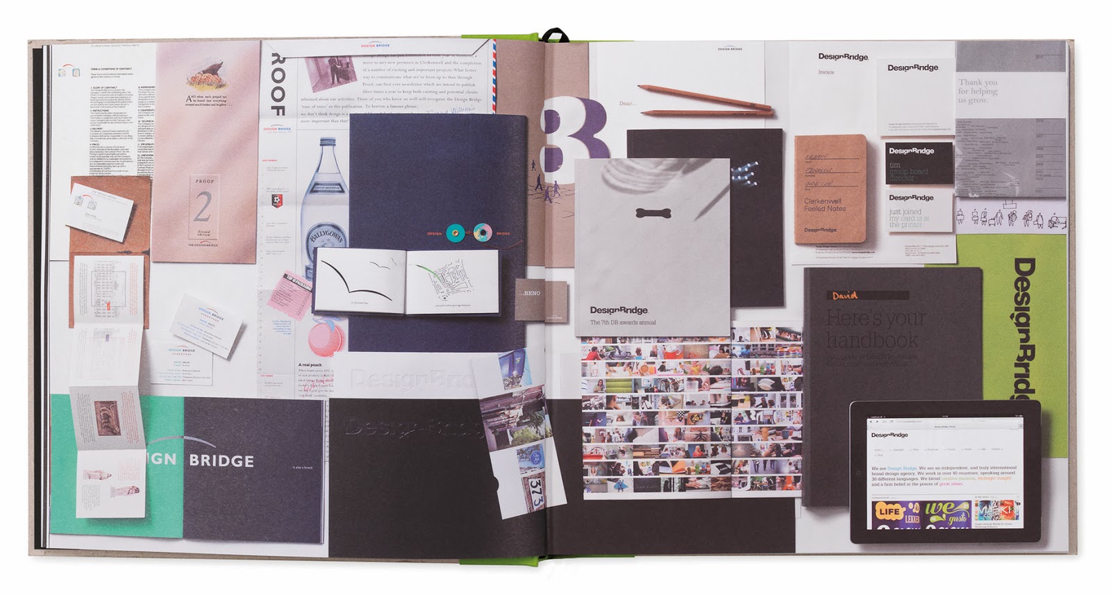
Singer sewn projects have appeared often enough on this blog that I can easily illustrate it with these existing projects. The below picture shows a singer sewn publication:
http://justinsamazingworldatfennerpaper.blogspot.co.uk/2011/03/wrangler-bluebell-ss11.html
There are however two distinct types of singer sewing and unfortunately in the mysterious world of print terminology, it's not always clear what people mean or what terms they are using, so I shall try an de-mystify!
 
The project below has been finished over a "saddle", in the same way that a "wire stitched" or "saddle stitched" job is finished (or as most people out of the industry would call it - stapled with metal staples). The term saddle is used because it sits astride a saddle in the same way as a saddle sits on a horse. This then allows the machine to guide the thread or wire, accurately through the folded spine. As with wire stitching, there is a limit to how thick you can bind, because you have to consider the fold. 
http://justinsamazingworldatfennerpaper.blogspot.co.uk/2010/11/wrangle-bluebell-fallwinter-2010.html
However, you can also set it up so that the thread penetrates the whole thickness of the publication and is therefore visible on both the outside front cover and outside back cover. Normally the sewing is set in about 5-10mm in from the spine, as in the picture below. Often this is done with loose sheets of paper (as below) and there is no folded paper on the spine and the edge of the paper is visible on the spine. 
http://justinsamazingworldatfennerpaper.blogspot.co.uk/2013/06/coming-up-for-air.html
Both examples above are accurately described as singer sewn. However, I prefer to call the above example (that goes through the whole book) "Side Sewing" as I think it is more descriptive but it is also referred to as "Stab Sewn". Like most terminology in printing, it is as much useful as it is a hindrance. Most important of all is to communicate clearly what is required, either in words, drawing or picture.

I am often asked if this type of binding is a machine process or a hand process. The best way to describe it, is a "hand operated machine process" as unlike a truly mechanised process, the book has to be manually handled through the machine .

Another feature of the binding, is that you can leave the thread hanging, rather than having it cut flush in line with the edge of the book. This can work beautifully with the design, as with the project below:


http://justinsamazingworldatfennerpaper.blogspot.co.uk/2011/03/jobs-from-past-number-17.html
Not all binderies have a machine that can do this type of binding but there are a fair few finishers around the country that can handle this type of work. If you want a suggestion, just ask me...
 
Posted by Justin Hobson 18.03.2014

Friday 14 March 2014

Design Bridge - 25 years

Design Bridge has published this beautiful book to celebrate their twenty fifth anniversary. This well known brand design agency started in London but now has a truly global reach with offices in Amsterdam and Singapore.
 
The book is titled 'Twenty Five Stories' and is a collection of 25 thoughts which make up a cohesive story of Design Bridge, about the brands, clients and products that have been the focus of their business over the years and include many references to that well known and popular Clerkenwell watering hole, The Three Kings!
 
The format of the book is 250mm square in a casebound greyboard cover with binding tape (in four different colours) along the spine which is silkscreen printed in black. The greyboard has been exquisitely embossed with 25 'tree rings' (or Dendros as they are known). 
The 122pp text is printed on our StarFine White 170gsm and is absolutely sublime, both in terms of the design and print (and paper, of course!) The text sections are printed offset litho in CMYK throughout with some of the sections printed with a pantone silver as well.
As one might expect, the quality of the images is superb and the quality of the print is stunning, the black solids are particularly impressive. 

The books are finished with a black headband and ribbon.
The team that designed and produced the book is Vicky Evans, Rhian Brain, Holly Pallister, James Minta, David Clabon, Craig Goldhawk, Nathan Jordan and Adam Stanley.
Photographers include Iain Crockart, Rupert Singleton, Lisa Tubbs, Ian Forsyth and Terry Benson.

The printing and production is by Identity Print, based in Paddock Wood in Kent and the print quality, finishing and binding is quite simply superb. Paul Winter handled the job at Identity.

All in all a beautifully produced piece of literature that will undoubtedly stand the test of time.

www.designbridge.com
www.identityprint.co.uk
...and it's also worth pointing out that we supplied the custom made boxes for the book, which as you can see from the picture are constructed in such a way that the books are perfectly protected.
www.designbridge.com
www.identityprint.co.uk
https://www.facebook.com/pages/The-Three-Kings-in-Clerkenwell/122709598813
Posted by Justin Hobson 14.03.2014

Thursday 13 March 2014

The Letterpress Collective

I've just been emailed with a pic of a lovely job printed on our board, which I want to share with you. It's been printed two colour letterpress on our Kemikal Cotton White 1500mics (...yes that's right, it one and a half millimetres thick!)  
 
It's a wedding invitation and it's been printed letterpress at Bristol's newest (and only) letterpress print workshop called 'The Letterpress Collective'
 
This new workshop started last year after the last letterpress printer in Bristol quietly closed it's doors, without anyone really noticing. Well someone noticed! ...as a small group of enthusiasts collected machinery, including a Heidelberg Windmill Platen, a Stephenson Blake proofing press, various Adana's together with a collection wood and lead type. Put this all together with a lovely workspace and experienced compositors and printers and you have a thriving environment for creativity - and education, as they run courses as well!
 
Do have a look at their site:
www.theletterpresscollective.org
The Letterpress Collective, Studio 31 Centrespace, 6 Leonard Lane, Bristol BS1 1EA

This invitation is designed by Tony Cresswell (...who's wedding it is!) and produced by Nick Hand, who is one of the founding members and keen letterpress printer.

www.theletterpresscollective.org
http://www.departmentofsmallworks.co.uk/

...and if you're interested to see a sample of the Kemikal, Cotton White 1500mic, just drop me a line and ask for a sample.
Posted by Justin Hobson 13.03.2014