Tuesday 7 March 2017

Kids With Puns #6

Kids With Puns is a printed publication which celebrates the humble pun. The magazine is a collaboration between illustrators, artists and designers and showcases a variety of wordplay related work. So if you love puns and visual puns in particular, you'll love this publication
Kids with Puns is the brainchild of designer Tom Dunn, who compiles and publishes the publication. It is published at irregular intervals - once he gets enough submissions!
Print is by Hato Press, who are based in East London and they have made a very tidy job of it. The size is A5 (210x148mm) portrait and is saddle stitched. It has a 4pp cover on our new Colorset Chilli 120gsm and 20pp text on StarFine White 115gsm.
The size is A5 (210x148mm) portrait and is saddle stitched. It is printed in just one colour on a Riso machine. If you don't know about Riso, or Risography, you can read about it on an earlier post I wrote here: http://justinsamazingworldatfennerpaper.blogspot.co.uk/2014/09/what-is-riso-printing.html
...Thanks to Tom for sending me the file copies.

You can buy your copy here: http://www.kidswithpuns.com/
http://hatopress.net/
Posted by Justin Hobson 07.03.2017

Monday 6 March 2017

Dolcelicious Launch

I'm pleased to announce that we have been appointed an exclusive UK stockist of James Cropper’s Dolcelicious range of papers.

The new Dolcelicious food contact-approved paper range was first shown by Croppers at theLuxe Pack trade show in Monaco last year. Dolcelicious is suitable for contact with dry, moist and fatty foodstuffs, it is available in 11 colours and meets a number of ISO standards. All papers in the range are FSC certified.
This is the first and (..so far) only, luxury direct food-contact paper available from stock and is a fantastic addition to our range.

We will be showing the range for the first time in the UK at the PrintWeekLive! exhibition in Coventry this week. You can read more about it here: http://www.printweek.com/print-week/news/1160448/fenner-paper-appointed-uk-stockist-of-new-james-cropper-range

If you would like to see samples, please let me know: justin@fennerpaper.co.uk

http://www.jamescropper.com/mill/
Posted by Justin Hobson 06.03.2017

Thursday 2 March 2017

Jobs from the past - Number 89

Regular followers of this blog will know that my first post of every month is a "job from the past" so that I can show some of the really good work from years gone by.

Update_01  July 2008 
Venture Three is a branding agency based in London. This is the first of their "newspaper style" promotional literature, produced in the Summer of 2008. 
The problem looking at an image like this is that you miss the scale of it! The size is 575x400mm, which is HUGE! ...and which is why there is an image below with a 450mm rule and a 380mm rule so you can get an idea of scale!
So that makes each of the following spreads a whopping 575mm x 800mm, which is more than enough space to show spreads of their work.
This is one of those projects that is hard to do justice to on this blog. The print image quality alone has left anyone that I have ever shown this job to, seriously impressed. It is a 24pp 'self cover' which has a deliciously floppy and tabloid newspaper feel. It is printed on our Redeem 100% Recycled 80gsm.
Given that Redeem 100% recycled is at best, off white and 100% recycled and 80gsm, the reproduction on this paper is superb. Below shows a detail of the new iPhone (well it was new in 2008)  It is printed CMYK plus a fluorescent green solid. Printed offset litho by London based Push.
As well as being a self cover format it is also completely unbound, so it flows beautifully in the hand.
As it is quite big and unwieldy, the finished item is 'endorsement folded' in half as in the image below....
Needless to say art direction and design was done in-house at Venture Three. The person who handled the project was Katy Bottomley but I'm afraid we've lost touch since.

Print is by London based printers Push and is truly superlative.
http://www.push-print.com/
Posted by Justin Hobson 02.03.2017

Monday 27 February 2017

Paul Smith - Spring/Summer

The Paul Smith brand (and person) has become synonymous with classic British tailoring and style. Renowned for well-made, good quality, simple cut clothing with interesting fabrics which is easy to wear. There is often a splash of vibrant colour, a floral print or the signature multi-coloured stripes. Paul Smith now has 15 shops and concessions in the UK and 200 shops worldwide with the business still based where it was founded, in Nottingham.

This is the lookbook for the Spring Summer collection. The finished size is A5 (210x148mm) portrait and it is a 16pp 'closed double gatefold' making the flat size 210x880mm.
..opening out to this spread:
...and then this one:
The below image showing both sides of the publication, fully open:
Click on images to enlarge
It is printed in CMYK offset litho on our Omnia, White FSC 280gsm and is printed and finished beautifully. Birds eye view below:
The material chosen is our Omnia 280gsm which gives it that dead matt, tactile feel but with great reproduction.

...and here's the plug for the paper!  - As you can see from these images, there is lots of colour and images with CMYK dark areas - loads of ink going down and it looks great on the Omnia, reproducing bright vibrant colours, whilst retaining detail in the dark areas (in my opinion- but I would say that wouldn't I?) See the detail in the bag image below
Although this is a simply produced publication, it's often the simple jobs which don't get the attention to detail. This is well creased and folded square which is just perfect
Creative direction and design is by the in-house design team at Paul Smith. Printing is by Leicester based Greenshires with Richard Dalby handling the project. Beautifully printed and finished - a really well produced piece. 

www.paulsmith.co.uk
http://www.greenshires.com/
Posted by Justin Hobson 27.02.2016

Friday 24 February 2017

Bookmark it.

Museums and Galleries is a publisher and producer of greeting cards, stationery and gifts. They specialise in producing items from the world of fine art and publish cards and other items from the V&A, other London museums and galleries and the Wedgewood archive.

These bookmarks are from a series produced from work by illustrator Faye Buckingham. Size is 160x48mm, punched with a hand tied ribbon.
Printed offset litho in CMYK, the bookmarks are printed on ZETA Linen, Brilliant white 350gsm which is duplexed with Matrisse 350gsm.
Below shows the detail of the linen embossing.
Click on images to enlarge
http://www.advocate-art.com/artist.faye-buckingham
Posted by Justin Hobson 24.02.2017

Monday 20 February 2017

This is not a hotel

This is the catalogue for the recent show (Nov - Jan 17) at the Yoshii Gallery in Madison Avenue, New York.“This is not a hotel.” is a solo exhibition of new works by Irish artist Guggi who is now regarded as one of the most accomplished and recognized painters in Ireland. This fully illustrated catalogue also features an essay by Irish film director Jim Sheridan.
The size of the catalogue is 205mm square. It has a 4pp cover plus 56pp of text. It has an 8pp "book-jacket" which wraps around the cover pages and the binding is three hole sewing.
The 8pp "jacket" is printed on Crush, Almond 120gsm and the first and last 8pp are on Crush Kiwi 120gsm. Below is the essay by Jim Sheridan:
If you aren't familiar with Crush, it is one of our ranges made by FAVINI in Italy and is made using 15% residues from the industrial processing of agricultural processing. As a result, the paper does have inclusions and a "rustic" feel, which you might just be able to see from the image detail below:
Click on images to enlarge
All images in the 40pp section showing the work of the artist are printed on a matt coated 115gsm paper. Printed CMYK offset litho throughout.
The catalogue comes in a contrasting, capacity envelope, also made using Crush Kiwi but this time in 250gsm.
...there are a couple of really wonderful details to point out. Firstly is the "Disc & String" closure on the capacity envelope, with black thread:
Click on images to enlarge
...and the three hole sewn binding in a natural colour thread.
You can read more about the exhibition here:
http://yoshiigallery.com/exhibition/guggi-this-is-not-a-hotel

Design of the catalogue is by Joshua Shaddock. Print and the wonderful and detailed finishing is by Push in London.

http://yoshiigallery.com/
http://www.guggi.com/
http://www.push-print.com/
Posted by Justin Hobson 20.02.2017

Wednesday 15 February 2017

Edinburgh Napier University 2017 Prospectus

Edinburgh Napier University is home to over 19,500 students from over 140 countries. Established in 1964, Napier now boasts six specialist schools, each an impressive institution in its own right, with world-class facilities, academics, researchers and international links.
 
This article is about the nine individual prospectuses they have produced for the 2017 academic year, each one for a separate school or course selection and each of these books is very special indeed!
Click on images to enlarge
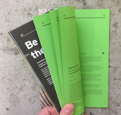
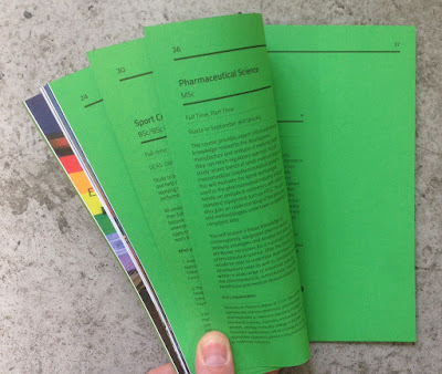
...as each of the books has a section with all the course information printed on a different colour of our Colorset 100% Recycled text, as you can see from the images below:
The books are all 235x165mm, which is an economical format on a B1 press using B1 size paper. They are portrait and are perfect bound. The prospectuses vary in pages from 50pp up to 82pp using a mixture of 115gsm uncoated offset paper printed litho in CMYK and Colorset in one colour litho (black)
Computing - Colorset Lemon
Engineering & the Built Environment - Colorset Lime
Criminology, Psycology & Law - Colorset Light Grey

Tourism - Colorset Mango
Business & Languages - Colorset Acquamarine
Arts & Media - Colorset Solar

Design - Colorset Pink Ice
Health & Social Care - Colorset Light Blue
Life & Sport Sciences - Colorset Spring Green
So what we have here is a really special collection of prospectus books. The self coloured text pages make each individual book clear and engaging - giving power and clarity to the text.
The books are all perfect bound (it's not possible to section sew with the variables in the quantity of pages)
Art direction and design is by the Marketing, Brand and Communication Department at Edinburgh Napier University.

Print and production is by J. Thomson Colour Printers in Glasgow and they have made a superb job of both the print and finishing.

http://www.napier.ac.uk/
Posted by Justin Hobson 15.02.2017