Friday 31 July 2009

British Museum Review

I've just received some copies of the British Museum Review 2008/9. Although it is called a "Review" it is really an Annual Report - and what a shame that we don't see Annual Reports like this in the corporate sector (anymore!)

It is designed by McConnell Design and Zach John was the senior designer on the project.

Beautifully "printed and bound in England" by Gavin Martin Associates ...take a bow Mr Gary Bird!

The text of the review is printed on Redeem 100% Recycled 100gsm. The cover is on a light brown manilla board and the paper weight dividers are on "Sugar Paper"
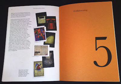
http://www.mcconnellstudio.com/
http://www.gavinmartin.co.uk/

New Review from Crescent Lodge

Every year Crescent Lodge produce a Review of projects they have done in the the previous twelve months. It demonstrates a real diversity of work ranging from their work in education, the Royal Mail, the London Philharmonic Orchestra to a private bank.

This review is printed on StarFine Natural White 150gsm and has a MirriSilver cover (in Bookjacket style).

The A5 format follows previous years and I'm lucky enough to have been involved in the past reviews, so I'm building a nice set now!

A really lovely touch is the letterpress card which goes out with the reviews which is hand printed in the studio at Crescent Lodge as they have a Letterpress machine (an Adana I think?) with and a selection of woodblock and metal type.

Design is by Lynda Brockbank (Creative Director) and Andrew Collier.

Printed by Granite


http://www.crescentlodge.co.uk/

http://www.granitecolour.com/

Thursday 30 July 2009

ie

Today I received this poster in the mail from freelance designer Ian Estevens.


As you can see it's very clever (I am speaking to a clever aud__nce, I hope!) so I know you'll all get the idea.


Beautifully produced, well printed on our Offenbach Bible 60gsm (very nice solid). It was printed by Beacon Press.


So if anyone needs a freelancer - you saw him here first! (and I don't charge commission!)...and there was a nice little post it note as well!


http://www.freelancer-ian.com/
http://www.beaconpress.co.uk/

Tuesday 28 July 2009

Paper is still the medium!

I popped in to Sea Design last week.

Unfortunately Bryan Edmondson was tied up in a meeting, so couldn't join us, but he sent down a note with one of the guys - which is loads better than somone just saying "...oh Bryan says hi"

and it goes to prove that paper is still a fantastic medium (even though I am writing this on a blog!)

Anyway, thanks Bryan ...and keep up the good work for GF Smith!

www.seadesign.co.uk

Monday 27 July 2009

10th V&A Fete 2009

This weekend was the tenth V&A fete and apart from the weather being a bit damp on Friday evening, the weather on Saturday really made it.

There were some fantastic stalls and there was lots to see and do.

As I mentioned in a previous post (17.07.2009) I was asked by the team at Johnson Banks to do a bit of guillotining. Anyway, all can now be revealed! The stall was selling recycled notebooks which were made up using all the old run outs from the last couple of years which they have been hoarding.

Combined with the corrugated packaging, they had also been hoarding and a wiro binding machine, they manufactured these recycled notebooks, which were then rubber stamped - to order.


Here's the set up...

The JB fete team and the rubber stamping table

and here's the tallperson (me) and slightly shorter person (Miho) who coordinated the notebook manufacture at JB.

Thanks to all at Johnson Banks for their hospitality and making me feel so welcome at their stall.


Check out the JB blog , for better pics and copy writing than mine!
http://www.johnsonbanks.co.uk/thoughtfortheweek/index.php?thoughtid=479

I also saw friends from Happily Ever After and Ico Design who both had stalls - I have some lovely badges from Leah at Happily Ever After, which I'll post once Mark has downloaded the images off my phone!
http://www.happily-ever-after.co.uk/
http://www.icodesign.co.uk/

Thursday 23 July 2009

New site

Check out www.dixonbaxi.com. It's a new site and well worth a look (sadly these guys don't use much paper but when they do, hopefully it's Fenner Paper!)

SHOP LONDON


Just received some file copies of this invitation piece/poster for the launch of SHOP LONDON MAGAZINE.

It's A2 size folding down to A6. Printed in just 2 colours on our lovely Offenbach Bible 60gsm.

Very nice and not a "crow's foot" in sight!

Design is by Studio8.

Print is by Granite


Wednesday 22 July 2009

The do lectures

The "DO" lectures is an organisation started by David Hieatt one of the founders of howies. The idea is to get together people who are real "doers" to do lectures and make them as widely available as possible. Their promotional mailer is designed by the howies in house team and was spec'd on Offenbach Bible 60gsm. It's A2 folding down to A7.

Check out http://www.thedolectures.co.uk/


Claire (who is the administrator at the do lectures) says I'm a real "doer" because made this all happen for her so quickly (and gave them a bit of help on the price of the paper) - how about that!

The job was printed in 2 colours offset Litho by Principal Colour. It was machine folded and then hand finished. http://www.principalcolour.co.uk/


These are some previous howies catalogues that we have supplied Colorset (100% recycled) for the covers. Designed by Nick Hand

monoblack

It's about time for a shamless plug for one of our stock products I think!

Monoblack is a product we introduced a few months ago. It is available in ONE weight (very thick), ONE size and ONE colour which is why it's called MONOblack - gettit?

Sometimes, designers I work with use a certain other well known brand of (very expensive!) coloured paper in 700gsm and then they have it duplexed together to make 1400gsm - and it costs them a fortune! So we put this single item into stock, which is "ready thick" and much more cost effective - and it's been going very well indeed. Many people use it for invitations, presentation boards and mounted covers or boxes where a black edge is required.

Anyway if you would like some samples, please send me an e-mail (justin@fennerpaper.co.uk) ... just please don't ask what other colours it comes in!

...and just to prove that Monoblack already has some fans, here's a lovely note from Kirsty at Pentagram who just returned a printed sample that I leant to her - thanks Kirsty


Tuesday 21 July 2009

First Light

My e-mail announcing the blog has attracted a few responses, including this package of items from Keith and Andy at d8 (Birmingham and Glasgow).

This is the literature from a new identity that they have designed for an organisation called First Light based in Birmingham. As you can see, it's a nice crisp identity using two strong colours (solids are printed on the reverse)

Also in the package was a copy of the A5 Annual Review which has striking graphics and printed using black and two fluoro colours. All the literature is printed on our 100% recycled Colorset (Natural) 120gsm


I don't know who the printer was, but they've made a very nice clean job of it.


And of course it's lovely to get a hand written note - which is not only a nice thank you but is beautifully produced - foiled in one colour ALSO on Colorset (Solar) 120gsm. Thank you Keith and Andy in Birmingham ...

Blog goes live!

My blog has now gone live (whatever that means) ...well, actually it just means I've told some people about it!

Thank you to all the people (and anyone else who knows me) who've sent encouraging e-mails, including Ian Gabb, the Letterpress "guru" at the RCA which says "...Yeah, fascinating! Sorry I'm being mean. I know no other way" - Just getting a response from you, Ian, is accolade enough!

I also have to thank Nick from NB:Studio for his lovely e-mail with the Subject title of "nicksfantasticresponsetoaninvitationtoviewjustinsnewblog.com"

I've taken Nick's suggestion very literally and scanned it in for the blog!

Thanks Nick


Monday 20 July 2009

Land Securities

As part of "The Great British Summer" promotion, Hat-Trick is producing a series of leaflets for events being held at the New Street Square retail development by Land Securities.

Each event is based on a sporting occasion and includes
free live outdoor screenings including Wimbledon and The Ashes.


The leaflets are being printed in one colour on Colorset (100% Recycled) 120gsm. The one shown here is printed on Colorset Amethyst.


Lovely illustrations with modest amount of print, really uses the material well and will be really distinctive against a pile of "busy" four colour leaflets shouting for attention!


British Council Newsletter

I have to admit that this isn't a spanky brand new job, but I was having a bit of a tidy up and saw this job which well deserves a look.

It is the newsletter for Design Architecture & Cultural Relations. It is A5 size and the cover (which is printed on Colorset Ash 270gsm) has a really simple but very effective fold over and tuck in flap. I think it's an excellent example of where a simple finishing technique has raised the production values on a job where the budget was not great. Another nice touch is the red coloured staples - very nice. Sadly they didn't use our paper on the text pages (I think this was dictated by budget) but I'm not complaining, as I got a nice note! - thank you Martin and Suzy.


Sunday 19 July 2009

Friday 17 July 2009

Paper cutting expertise!

I do get some pretty strange requests in this job - but then that's what makes life quite interesting! Anyway, I was asked by the team at Johnson Banks if I could help out with a little bit of cutting using our guillotine. Well it turned out to be slightly more than one or two sheets (more like many thousands!) but we made short work of it using our guillotine that we have for cutting all our samples and dummies. My colleague Mark is pictured above, surrounded by the various sizes.

The sheets are being used by Johnson Banks at their stall at the V&A Fete at the end of next week. Can't say too much about the idea (client confidentiality and all that!) ...but it does involve paper!

http://www.johnsonbanks.co.uk/thoughtfortheweek/index.php?thoughtid=474

Grey Skies & Pigeons & Red Shiny Buses

Have a look at this poster. Designed by Studio8 this 'London' poster is an A2 2-colour screen printed poster. Numbered edition of 250. It is printed on a hemp paper (135gsm) which I had made as a trial some years ago. They had wanted an off white material which had a tactility to it and this paper fitted the bill perfectly.

If you like the sound of the paper, sorry but that was it - the very last sheets were used on this job! Truly a limited edition!
http://www.studio8design.co.uk/
It was printed by Josh at White Duck Screeprint in Bath and he's made a lovely job of it. http://www.whiteduckscreenprint.co.uk/

Thursday 16 July 2009

Thank you to BOB

I have to say a big thank you to Tom at BOB Design. A couple of years ago BOB produced a great invitation for the fashion label TU who launched a range of Fairtrade cotton clothing. The invitation was very simply foiled on our recycled Construction, Blackstone 1500 microns - it's an invite which lands with a real thud! The Construction is a very "dense" board and the contrast of the fine foiling in a gunmetal/silver against the recycled substrate really works. I was given a few file copies which over the months I have leant to people - but not got them back (... if you're reading this, you know who you are!) So, a couple of months ago, I asked if they had any left at BOB but they didn't have any - but today I had a lovely surprise as they found some in their "tidy up" and sent them on to me - so thank you for remembering Tom.

P.S. If anyone reading this has any file copies printed on our paper, please remember to send them to me - they will be gratefully received!

Tuesday 14 July 2009

Launch for Beam


I want to send my best wishes to Christine Fent and Dominic Latham-Koenig who are launching their new company "Beam" at a party tonight. Sadly I can't be there but it was lovely to have been invited, especially with such a lovely "flickbook" invitation.


Although sadly not on any of our paper, it is a really lovely idea. The flickbook is produced by Swiss bindery BuBu (http://www.bookfactory.ch/) and works really well. If I was a bit more tech'd up, I'd have put a video here flicking through it, but sadly I'm not that sorted!


Best wishes to Christine and Dominic.

Monday 13 July 2009

Channel 4 Annual Report

I have just received some copies of the new Channel 4 Annual Report designed by NB:Studio.

This is a lovely piece of literature which has just the right "feel" in the hand. The size is 325x240mm - nice size.

The covers are "wrapped" in single sided posters. There are four different versions of the posters reflecting each of Channel 4's public purposes. All the posters have a sticker affixed.

This 138pp document is printed on Marazion Ultra 90gsm which some might consider a bit light - but it works really well. The paper has got a really good opacity and has taken the images really well (but I would say that wouldn't I?). The spine is around 8mm thick.

The job was printed by Push (http://www.push-print.co.uk/)

My advice is to see if you can get hold of a copy. Given the dire quality of the vast majority of annual reports that I see nowadays (unlike some of the great pieces of work produced in the 90's!) , this one is really worth seeing.

Friday 10 July 2009

Paper Swallows

Last week, I was asked by fashion house GHOST if I know anyone who did origami! Well luckily, I remembered that Eng Su, who I first met at NB:Studio and who is now freelancing (see my post on 13/06/09) has a penchant for the papery art! ...so after a couple of quick phonecalls I put the two in touch and Eng made over 50 swallows for their new catalogue launch event yesterday.

They used a mixture of Offenbach Bible 60gsm and StarFine White 100gsm.

Everybody was happy!
Here is a pic and a lovely thank you note from Eng - thank you.
http://www.engsu.co.uk/

Tuesday 7 July 2009

Letterpress Invite

Jonathan at Campbell Hay has just sent me some file copies of an invitation which has been printed two colour Letterpress. The material that was chosen was our Matrisse 450gsm which is a very heavy weight, bulky, high white, tactile uncoated board. Most importantly, it is made in a single ply and therefore less prone to warping than duplexed materials.

It is a simple, clever design, well executed.
...and a lovely note is always appreciated - thank you Jonathan

ISTD awards & special congratulations to Lincoln...

On Friday evening I was invited to the ISTD Student awards evening which was hosted at The Partners in London EC1 (thanks to Creative Director, Jack Renwick). It was an excellent evening and it was good to see so many people that I've worked with over the years (The ISTD is a fantastic organisation and I'm proud to have been working in association with them since the mid nineties). http://www.istd.org.uk/

Alan Kitching presented the certificates and it was a great evening.

It was particularly eventful for the Lincoln School of Art & Design (University of Lincoln) as not only did 8 of their students walk away with certificates but the Vincent Steer award (which is the highest student accolade) was presented to Chris Mahoney for his project "MP3".

...and only the evening before, at the D&AD Student awards, the team which had designed and organised "The Design Auction" were awarded a yellow pencil. http://www.designauction.co.uk/. The team are Toby Burkill, Danny Elliot, Steve Fenn and Lauren Traynor - congratulations to you all.
I have been working with some of the tutors at Lincoln for a few years now and I have done a few talks to their courses. These award achievements really are a reflection of the dedication and quality of the tutors at this particular college, in particular, Barrie Tullett, Philippa Wood and John Dowling (part time). They really are an example of a department that goes that extra mile - and the results (and quality of their students) are there for all to see...
http://www.dowlingdesign.com/
http://www.the-case.co.uk/