Wednesday 30 November 2011

Camberwell College of Arts - BA Hons Sculpture 2011

This is a piece of literature produced for the BA (Hons) Sculpture 2011 course at Camberwell College of Arts.  It is A5 (148x210mm) size and is saddle stitched. It has a lightweight cover which is cut 40mm short at the head, which opens up, like so...
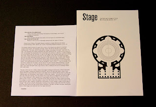
4pp cover on Neptune Unique 120gsm, 20pp text on our recycled Brand X FSC 150gsm which has a warmer, natural, shade which contrasts well with the whiter, lightweight cover material. Cover is printed in one colour (black) both sides, text is CMYK throughout. Nice clean job and fairly economical to produce.
The project was designed by Joe Hales who was working in conjunction with Josie and Julia who are two students on the course. It was printed by Calverts Press in London.
...and thanks to Josie and Julia for their lovely note and for taking the time to send me some file copies.

http://showtime.arts.ac.uk/camberwell/2011/ba-hons-sculpture
http://josiecockram.com/
www.juliagray.co.uk
http://josephhales.co.uk/
www.print.coop
Posted by Justin Hobson 30.11.2011

Tuesday 29 November 2011

Fish and Chip paper

Some readers of this blog may be old enough to remember when fish and chips were actually served in old newspaper (I do and I'm not that ancient, honest!).
Well, I was pleased to be able to help out on a lovely little touch at a wedding, where they served fish and chips at the evening reception. Two pages of the local newspaper from the day that the couple were both born was reproduced on our Redeem 100% Recycled 60gsm. As you can see from the pics, it all worked rather well!

...and here are the happy couple, Ben and Gemma:
The idea and production was by Phil Bold, designer at GBH, who is Gemma's brother! ...and he lovingly printed them all too.

Posted by Justin Hobson 29.11.2011

Monday 28 November 2011

3D Printing - the future is coming!

I was recently contacted by a company offering a 3D printing service, which I thought I'd share.

I have heard a bit about 3D printing or "rapid prototyping" as it is sometimes called, but hadn't really looked into it in too much detail. This new technology has the ability to change the way we manufacture individual (custom) items and could literally be the pathway to us having the ability to make individual items in our own homes and offices - and has the potential to produce everything from machine parts to replacement teeth!
The company that sent me the information about their 3D printing service is positioned at the more "novelty" end of this new technology, although a very nice novelty it is...

Have a look ...maybe there's a Christmas present idea here! 

for more info about 3D printing:
Posted by Justin Hobson 28.11.2011

Thursday 24 November 2011

French Connection

This is a few months old now but I've only just got some file copies - It's the publication to accompany the French Connection marketing campaign for the Summer - it was a big press campaign, so I'm sure that some of the images will be familiar. As you can see from the pics below, it is a beautiful piece. Art direction, photography and reproduction is superb.


It's a 40pp self cover. Size is 240x345mm, portrait  and it's printed on Marazion Ultra 90gsm. It is loose bound - no saddle stitches.
Art Direction, design and production is by French Connection. It just has a fantastic feel - it is difficult for me to say much more about it - just look at the images, they speak for the job...

It is a "double ended" publication - ie two front covers, one way works as Womens (above) the other way works as Mens (below)

Design is by Graeme Williams. Print is by Geoff Neal Litho. A lovely piece

Posted by Justin Hobson 24.11.2011

Tuesday 22 November 2011

Mantis World 2011

This is a catalogue produced earlier in the year for ethical clothing company Mantis World.

For this catalogue, the desire was for a "tactile" cover material that had an uncoated feel but that wouldn't let down the brightness of the colours and to introduce a "magazine" section with interviews and news. The factory that makes these clothes is in the shadow of Mount Kilimanjaro in Africa and they use 100% certified organic cotton and are a pioneer in ethical manufacturing, therefore using environmentally concious materials is important.

The eventual choice of materials combined the tactile Omnia as a cover but only in 200gsm (which is very bulky) with our lightweight Redeem 100% Recycled in 70gsm which has a newsprint look and feel for the "magazine" section. This was combined with some Hanno Art Gloss (FSC) for the basic text pages.
All the below spreads show imagery reproduced on Redeem 100% Recycled 70gsm - exceptionally vibrant result:
The job is 4pp cover with a 124pp text. Size is 165x220mm, portrait, perfect bound.
Print is by Quadracolour.

Design is by Astroman. Creative Director on the project was Doug Hurcombe. Designer on the project was Katerina Karamallaki and thank you for the lovely note...
Posted by Justin Hobson 22.11.2011 

Monday 21 November 2011

New Press at Push

Regular readers of this blog will know that apart from some beautifully printed work demonstrated on this blog, there isn't very much good news in the printing industry. Many companies have simply gone bankrupt Midas Press, Good News Press, SV2, Moores, to name but a few, so positive news is hard to come by.

However last week, I popped in to London printer Push who are in the middle of installing a brand spanking new B1 Heidelberg Press (a CX102) ...and below are the pics of installation in action.

This represents an extremely big investment but demonstrates that if a company wants to continually improve quality and keep up with the latest technology, it must invest.

Good luck and good printing!

www.uk.heidelberg.com
Posted by Justin Hobson 21.11.2011

Thursday 17 November 2011

Morgan McKinley

This is an excellent example of a corporate brochure. It is beautifully designed, with innovative print and finishing features and is produced to a very high standard.

Morgan McKinley are a company working in the global professional recruitment industry and this corporate brochure is to give a company overview to potential clients.
Hot foil blocking in gloss black foil together with matt red foil features on the front cover and on the endpapers, gloss UV varnish used to great effect, below.
The publication is 215x280mm, Landscape, perfect bound. It has a 4pp cover, 2x2pp endpapers (front and back) and a 28pp text printed on our Omnia 150gsm - which as you can see from the mono photography and the flat solid areas of red and black, have given this job an amazing mattness and tactility.


Design is by Glazer. Creative director on the project is Jonathan Wybrow. Print and finishing is by Gavin Martin.

One final word ...how lovely to see an outstandingly produced corporate brochure that doesn't rely on stock photography, bright four colour work and glossy paper - it looks great.

Wednesday 16 November 2011

BSME Art Director of the Year 2011

Simon Esterson
Last week, at the British Society of Magazine Editors awards, Simon Esterson, editor of Eye Magazine won Art Director of the year (Business publications). Congratulations to Simon and the whole team at Eye for this success.

In the last few years since Esterson took control of the publication, Eye magazine has truly gone from strength to strength and at a time when magazine publishing, in general, is going through a difficult period.

Although we do supply a small amount of material for the magazine (not the main text) I wouldn't want anybody to think reading this that I'm just "sucking up"! Quite apart from the paper, in my opinion it is an excellent publication and well worth subscribing to ...so there!

Here are some previous posts about Eye:
http://justinsamazingworldatfennerpaper.blogspot.com/2011/02/eye-78-seven-colour-marathon.html
http://justinsamazingworldatfennerpaper.blogspot.com/2010/08/eye-76.html
www.eyemagazine.com
Posted by Justin Hobson 16.11.2011

Tuesday 15 November 2011

And the Sun will Shine...

Well if your Tuesday, November morning is looking as grey and dank as mine, here's something that will brighten it up!

I've just received a lovely screenprint from designer and illustrator Billy Allinson, who produced this print on our Colorset, Natural 270gsm (100% recycled) ...and he very kindly sent me one.
Size is 330x475mm
I first met Billy at Kingston University as he was arranging the invitations and promotional material for their graduation show. Since then he worked for many years at Formula One, designing a wide range of their promotional material including a party invitation for one of Petra Ecclestone's extravagant parties!

Billy now combines working with his own clients with freelancing and has his own silkscreen studio  - a man of many talents!
www.billyallinson.com

...and thanks for my lovely print which is definitely brightening up the day!
Posted by Justin Hobson 15.11.2011

Thursday 10 November 2011

London 2016

This is a fascinating and beautifully produced book commissioned by leading international property consultancy, Knight Frank to visually communicate their predictions for London's commercial property market, in a project titled 'London 2016'.

Five years doesn't seen too far away, but the invitation to their September conference is worded as follows:
"In 2006, no one owned an iphone, Lehman Brothers' market capitalisation was $40 Billion and Bear Stearns' was $20 Billion, Iceland had a triple A credit rating, Twitter signed up it's 50th tweeter in July - think how different the world will be in five years time..."
(...that makes you think!)

Knight Frank commissioned London based agency YCN to produce the conference collateral, including this specially produced book to be given as a take-home pieces for select clients detailing the company's view of London in five years time.

The size of the book is 185x245mm, portrait. It is printed on SHIRO Echo, White (100% recycled) which has a "natural" off white shade and works well with the illustration and text. The book is made using two text weights 160gsm for the three throw-out pages and 100gsm for the main text made up of 45 "French Folded" sections.
The casebound book is covered in dark grey bookcloth and is hot foil blocked in silver.
All the text is "French Folded" as you can see below:
The creative team at YCN on the project is as follows:
Project Director: Alex Ostrowski
Art Direction & Design: Alex Hunting
The text features illustrations by Samuel Green and infographics by Chris Clarke
...and particularly remarkable (other than the paper, of course!) is that the job has been printed digitally by Pureprint on an HP Indigo press and the result is just superb. The solid colours alone compete with the quality achievable with offset litho. Simon Cooper at Pureprint handled the project.
 ...and a lovely touch is the rubber stamp used to personalise and number each of the 150 copies:
http://www.knightfrank.co.uk/
http://agency.ycnonline.com/
http://agency.ycnonline.com/people/portfolio/samuel-green/
http://www.chris-clarke.co.uk/
www.pureprint.com
Posted bu Justin Hobson 10.11.2011