Tuesday 29 March 2016

8 Lloyd's Avenue

I've written many posts on this blog which includes the phrase "...just the cover makes the difference!" The cover on this property brochure certainly does - it's simply a stunning piece of design with amazing hot foil blocking.  
The size of the brochure is A4, portrait and has a 4pp cover with a 12pp text. The cover is hot foil blocked in metallic gold foil and white matt foil. The cover is produced on our Notturno 450gsm and the text pages printed offset litho in four colour process on 'house silk' 200gsm
Click on images to enlarge
For those not familiar with the Notturno range, it is a range of black papers and boards from Cordenons. The range has a wide range of substances 90, 110, 140, 170, 200, 250, 300, 350, 390, 450 and 700gsm - a pretty big range!

A lovely finishing touch is the use of brass wire stitches
Print and the superb hot foil blocking is by CPI Colour. It's worth noting that CPI have their own 'in house' foiling facilities in Croydon, including their own blockmaking. 
Art direction and design is by London design studio Cre8te. Print is by CPI Colour with James Lager handling the project.
www.8lloydsavenue.London
http://www.cre8tedesignuk.com/
http://www.cpicolour.uk/
Posted by Justin Hobson 29.03.2016

Thursday 24 March 2016

Introducing new Crush Grape

Many of you will know about our lovely range called CRUSH from Favini. The paper is made partly using the residue from the industrial processing of crushed citrus fruit, coffee, nuts, olives, kiwi, corn, lavender and cherries. These agro-industrial "end of life" products replace up to 15% of conventional tree pulp. The range is available in 100, 120, 250 and 350gsm and the shades are natural, earthy tones and the feel of the paper is natural and tactile. We originally launched the range in 2013 and there have already been additions to the range last year.
Favini has recently been working with champagne house Veuve Clicquot to develop a range of packaging using the left over grape residues from the production of their champagne, which has resulted in this new Veuve Clicquot packaging, Naturally Clicquot.
The packaging won the Formes De Luxe prize at the Luxepack exhibition in Monaco last September and you can read about the project HERE:
"Every year this prestigious prize is awarded to the most innovative and creative packaging and is selected from a group containing the best internationally renowned companies. Naturally Clicquot 3 comes from a creative reuse of byproducts from Veuve Clicquot’s own champagne production process. By implementing their vision to continually reduce their environmental impact, now means that after being pressed, the residue of grape skins can be used in a new way. Through Favini’s know-how in the creation of papers made of residues from agro-industrial productions, the skin is dried and then milled to become a raw material for the production of a unique ecological paper, saving 25% of virgin pulp. Favini introduced the residues into the paper production cycle, mixing them with water and natural fibres, which in turn reduces the use of cellulose from trees. Veuve Clicquot said the new Naturally Clicquot 3 packaging is a unique product that gives a new life to the production residues from one of the most renowned champagnes, whilst replacing a quarter of virgin fibre use. Moreover, in perfect harmony with this ecological paper, the graphics are printed using solvent-free paints and labels adhered with a sugarcane-based compound."

...and the good news is they have now applied their experiences to make a new addition to the CRUSH range - CRUSH Grape!
New Crush Grape, is available in the standard substances of the other products (100, 120, 250 and 350gsm) with the addition of an additional 90gsm with "wet strength" properties, making it suitable for labelling applications such as wine bottle labelling.
Here is the new swatch (branding by Silk Pearce)
Crush is FSC certified, GMO free, contains 30% post-consumer recycled waste and is produced with 100% green energy. The production process and the product are protected by European patent. Including the new Grape, the range now consists of ten shades.
If you would like samples, please get in contact and I'll send you a new swatch.
http://www.favini.com/gs/en/fine-papers/crush/all-about-crush/
http://www.favini.com/en/news/crush-the-grapes-and-get-paper/
http://www.favini.com/wp-content/uploads/2015/10/PPI-Paperboard-Packaging-Online-ottobre.pdf
http://www.packagingnews.co.uk/news/materials/corrugated/ds-smith-and-favini-help-veuve-clicquot-win-award-28-10-2015
Posted by Justin Hobson 24.03.2016

Tuesday 22 March 2016

Pearlfest 2016

The other week, the glamorous reception area at Pearlfisher was turned into a pop up silkscreen print studio.
Gary Parselle from The Private Press set up his temporary silkscreen print workshop, so the whole creative team got their hands dirty experiencing hand silk screen-printing for themselves.
Just using a few colours, plus a few different screens and our lovely Colorset 100% recycled paper.
...and hey presto, lots of different results
...we were asked to supply a selection of different colours from our Colorset range in 270gsm. For those of you not familiar with this collection, Colorset has 26 colours and is made from 100% Recycled fibres. All colours are available in 120, 270 and 350gsm. Amongst other uses, it's become a firm favourite with Silkscreen printers.The colours you see here are Deep Orange, Mango, Lemon, Lime, Aquamarine, Magenta, Pink Ice, Ash, Solar, Nero, White and Natural.
The workshop was run by Gary Parselle from The Private Press who's studio is based in Brighton. The event was arranged by Jenny Cairns and Managing Director Darren Foley.
Small scale events like this are such a great idea. It exposes a whole team to a shared creative experience and with a "pop up" like this, no need to travel!

www.theprivatepress.org
Posted by Justin Hobson 22.03.2016

Friday 18 March 2016

Sprayed invitations

These are the invitations to last Summer's exhibition at the Gagosian Gallery in London, called Sprayed.
This extensive exhibition spanning four generations explores the myriad ways in which artists have employed the impulsive yet de-personalized and non-gestural forces of spray. It begins with Paul Klee's work on paper Seltsames Theater (1929), where he improvised with a blowpipe to achieve hazy background effects in a circus scene. This tentative experiment presaged the bold and diverse artistic licence that would come with the post-war advent of aerosol paint as a consumer product and the use of the industrial paint compressor.
Click on images to enlarge
Printed in CMYK onto a selection different colours of Colorset 120gsm colours, the sheets have been mounted front and back onto 1250mics Greyboard. Size of the invites are 200x250mm.
 The invitations reflect the catalogue
The exhibition features works from over fifty artists and is organised by Jona Lueddeckens and Greg Bergner.

Design of the invitations and catalogue is by Graphic Though Facility. Print, production and finishing is by Pureprint.

http://www.gagosian.com/exhibitions/sprayed--june-11-2015
http://www.graphicthoughtfacility.com/
http://www.pureprint.com/
Posted by Justin Hobson 17.03.2016

Wednesday 16 March 2016

What is ...Spiral Binding?

What is ...Number 27
Regular followers of this blog will know that in the middle of the month, I publish a "What is ....? post. The article covers various aspects of paper, printing and finishing in greater depth. However, many of these subjects are complex, so these posts are only intended to be a brief introduction to the topic.

What is ...Spiral Binding?
Spiral binding, also known as plastic coil binding is a useful, functional binding method and a worthy alternative to Wiro Binding. The advantages are that the text pages lie completely flat when open and that the plastic is virtually crush resistant, unlike wire-o, which when bent, will never truly regain it's shape.

Here's an example of a project which has been spiral bound using a clear (transparent) spiral
 ...a close up of the spine:
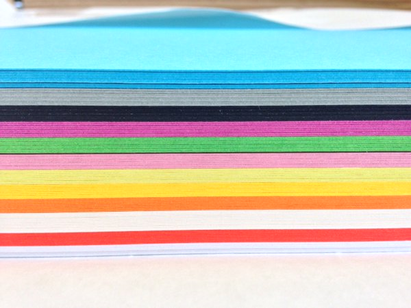
The binding elements are available in 16 standard colours and can even be bespoke manufactured to special colours for large enough runs. They come in standard sizes from 6mm to 50mm in diameter.
Image courtesy of Dash Finishers: http://dashfinishers.co.uk/
Using a specialist binding machine, these elements are “spun” through punched holes in book blocks and crimped in place. Below is the Hato Press studio Cookbook, bound in a deep red spiral.
Spiral binding is a popular option for products that are frequently handled in classroom and industrial settings such as calendars, children’s books, cookbooks, instruction manuals and even paper swatches!
One important consideration when using spiral binding is the "step up" which happens. As you might notice from the picture below the page on the right is stepped up and this is because it is made from one continuous spiral.
Below is a detail of the top of the spine
 ...and the bottom of the spine:
Therefore the one important piece of advice when using spiral binding is to avoid image or type read-overs over the spine. 

With thanks to Dash Finishers for the information and help.

http://dashfinishers.co.uk/?p=68
Posted by Justin Hobson 16.03.2016

Monday 14 March 2016

Alexander Lewis - Resort 2015

This is a beautifully simply lookbook for London based fashion designer Alexander Lewis. Half American, half Brazilian, his education took him around the world, before working for Vogue and then began working on Savile Row, at Norton Sons and later E. Tautz. In London he learned about pattern-cutting, fit and how to turn a design into a beautifully crafted piece of clothing. After establishing his own design consultancy, he launched his own womenswear line in 2012.
This is the lookbook for his Resort 2015 collection. and as I said in my introduction, it is beautifully simple. Size is A5 (210x148mm) portrait and has a 4pp cover on our Colorset Nero 270gsm, which is simply hot foil blocked with matt white foil.
Detail of matt white foil
  
Image reproduction is paramount but it was also important that the publication also projected the tactility of the actual clothes, so a gloss or silk coated paper wasn't an option. The material chosen was our Omnia, which would beautifully reproduce the photography with the delicate weave, intricate patterns and subtle pastel colouring superbly - not forgetting the fleshtones ...and it looks brilliant!  The 52pp text is on Omnia White 150gsm, printed offset litho in CMYK throughout.
Click on images to enlarge
Omnia is a very bulky paper, so even though it is only 52pp, the Omnia 150gsm gives it a 5mm spine thickness. As with all quality publications, it is 'section sewn' and here is a close up showing the spine and end of the book with the sewn sections:
Art direction and design is by Alexander Lewis. Photography is by Thomas Lohr. Printing, foiling and finishing is by Jigsaw Colour, based in South London. Paul Martin dealt with repro and production.

http://www.alexanderlewis.eu/
http://thomaslohr.com/site/
Posted by Justin Hobson 14.03.2016

Wednesday 9 March 2016

Why Make Sense?

These are the tour posters for a band called Hot Chip. The tour follows their latest album Why Make Sense? This new LP features the acclaimed singles Huarache Lights and Need You Now. Recorded in Oxfordshire and London and produced by Hot Chip with Mark Ralph and mixed by the band, David Wrench (FKA Twigs, Caribou) and Jimmy Douglass (Timbaland, Aaliyah). The album features guest appearances from De La Soul’s Posdnuos and Scritti Politti’s Green Gartside (Love Is The Future), as well as live instrumentation and backing vocals from touring band members Sarah Jones and Rob Smaughton.
The A2 size posters are silkscreened in three colours on each side and the inks have been changed to produce four different colour versions as you can see in the below picture.
Click on images to enlarge
The posters are printed on our StarFine White 300gsm and the result is simply stunning - depth of colour is superb: 
The posters are designed by Nick Relph. He also designed the album covers, which due to a unique algorithm, randomly alters each album cover resulting in each cover being different. You can view the artwork, designed by Nick Relph, here: http://www.dominorecordco.com/whymakesense/artwork/
 
...and you can read about the album project here: http://www.itsnicethat.com/articles/hot-chip-why-make-sense
 
The prints were screen-printed by Gary Parselle at Brighton based silkscreen studio, The Private Press.
 
Posted by Justin Hobson 09.03.2016

Tuesday 8 March 2016

St Bride Student lecture

Yesterday, I attended a lecture day at St Bride's put on for students which was funded by the Wynkyn de Worde Society Charitable Trust. The speakers at the event were Alistair Hall (from We Made This), Sharon King-Chai (an author-illustrator and book designer) and Chris Bounds (from Carter Wong design). There were around a hundred students from universities around the country. I spoke to some from Kingston, University of the Creative Arts and University of Reading.
Alistair Hall gave a special insight into the way that the Ministry of Stories initiative started followed with an amusing set of anecdotes about the Hoxton Street Monster Supplies - truly this is an example of where design has helped changed people's lives for the better - over a thousand children helped with writing every year.  
Sharon King-Chai spoke about her career, from her arrival in the UK to getting work experience, her work designing album covers and her transition into the world of publishing. One slide in particular struck a note with me ...be nice
Doesn't matter who you are - being nice is the right thing. Even when you have to say NO, you can still do it nicely.

I took a few printed examples to show, to inspire students about the quality print work that is out there and what can be achieved.
It was a very interesting day and I'm sure the students that were there found it inspiring and useful. The print workshop was also open which gave people the opportunity to print some letterpress keepsakes to take home.

If you would like to stir the greymatter, how about going to the Type Tuesday event this evening, run by Eye magazine? The archive evening is hosted by Paul Barnes and there are half a dozen speakers talking about their favourite items found in St Brides. You can read about it here: http://www.eyemagazine.com/blog/post/type-tuesday-archive-night-with-paul-barnes and you can buy tickets from Eventbrite - only £12.00. Go on, get out and feed the brain!

Posted by Justin Hobson 08.03.2016

Friday 4 March 2016

Grosvenor in Mayfair

33 Grosvenor Street is a period townhouse reimagined as a headquarters building. The building’s contemporary new Grade A office accommodation is joined with listed period space to provide an a business environment in one of London’s most prestigious addresses, Mayfair. The building is situated on the north side of the street between Grosvenor Square and Davies Street.

This luxuriously presented brochure conveys all the attributes of the building is a tactile and engaging way. The size of the brochure is 285x216mm, portrait and comes wrapped in printed tissue, affixed with a label.  
The 4pp cover is hot foil blocked on sandgrain embossed, dark grey 350gsm coverboard, from the other "Hull based" paper merchant!
The construction is actually quite unusual. The text is 'singer sewn' and, because there is a translucent flysheet on tracing paper, the flysheet is affixed to the back of the text and then the back of the flysheet is then affixed to the inside back page of the cover. A good solution allowing the text to sit nice and flat.
Click on images to enlarge

The 32pp text is printed on Omnia 150gsm and is simply sumptuous. The text is printed offset litho in four colour process plus a 'special' colour which is a dark grey. The dark grey solid is grey and very solid - just right. Omnia was selected because it would work with the rich detail that is present in the images of the interiors but that would still give a natural look and tactile feel. As you can see from images, some of the photography has dark areas, but there is no loss of detail, which often happens when printing on a traditional uncoated paper.
Detail showing printed solid
The interiors look fantastic - the classical meeting the contemporary.
...and this is something that sometimes people miss - text on it's own (below) just looks, and feels, good printed on Omnia. The type stays sharp and the black looks very black.
Art direction and design is by London design studio Cre8te. The excellent repro, print and finishing is by CPI Colour with James Lager handling the project (inspire@cpicolour.co.uk)

http://www.33grosvenorstreet.com/
http://www.cre8tedesignuk.com/
http://www.cpicolour.uk/
Posted by Justin Hobson 04.03.2016