Tuesday 31 May 2016

JLR Editors Club Brochure

This is a piece of literature produced for Jaguar Land Rover PR and press department. The publication embodies all the core values that JLR stand for and consequently is produced to a very high specification.
The brochure comes in a slipcase/pocket, which together with the 4pp cover is made using Plike Black 330gsm from Cordenons. Size of the brochure is 240x168mm, portrait.  
The slipcase and cover is hot foil blocked in silver foil and the edges are gilded in silver, which does look exquisite.
The 40pp text is printed on our Omnia 120gsm offset litho - and it is printed wall to wall, solid black, CMYK images plus a special silver - all the type is printed in silver.
In line with the quality look and feel of the brochure, the biding is Singer sewing, which is totally characteristic for this brand.
The reproduction on the Omnia is magnificent, the CMYK, the solids and the silver which looks metallic, as you can see from the image below.

Art direction and design of the catalogue is by Imagination. Graphic designer on the project is Amish Shah  (www.work-in-process.eu). This is an exquisitely produced brochure which conveys exactly the right look and feel of luxury. Print is by Identity, based in Paddock Wood.
Posted by Justin Hobson 31.05.2016

Friday 27 May 2016

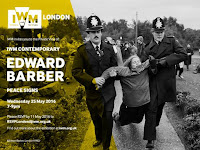
Peace Signs by Edward Barber

I was very pleased to be invited to the viewing of Edward Barber's exhibition 'Peace Signs' which opened at the Imperial War Museum contemporary space on Wednesday. Ed Barber is a photographic artist, specialising in images of people and their relationship to space and environment. He is best known for his portraiture, through major projects such as All Dressed Up, In the City and Resolve. He is one of the few photographers to have their work displayed and in the collection of the National Portrait Gallery. He is also a designer, curator and teacher, and was formerly Subject Director for Fashion Photography at the London College of Fashion.
Ed recorded major protests staged at key sites such as RAF/USAF Greenham Common, Westminster, Trafalgar Square and the City of London. The body of work is a unique social document of mass popular protest in late twentieth century Britain which has rarely been seen in public since it was first published in 1984.
Peace Signs, Barber’s collected body of work, was originally taken to attract media attention to the anti-nuclear movement. The exhibition explores these protests as multi-generational and distinctly British forms of self-expression. Illuminating the activists’ humour and creativity, these images create a social record of both individual and collective responses to war. The photographs capture hand-rendered signs, banners, badges, clothing, make-up and costumes, and illustrate the often overlooked role of performance theatre, folk art and fashion at peace camps and demonstrations.
The display, with the background painted in 'nuclear' yellow, offers a fresh interpretation of the images, the photographs are contextualised by a graphic installation entitled Mind Map of Anti-Nuclear Protest, created by Danielle Inga and Edward Barber specifically for this exhibition. The Mind Map traces his contemporary re-evaluation of the events he captured in the 1980s - see below pic. Unfortunately my picture doesn't do justice - so you'll have to go and see it for yourself! The exhibition runs until 4th September.
http://edwardbarber.net/
http://concreteed.blogspot.co.uk/
Posted by Justin Hobson 27.05.2016

Wednesday 25 May 2016

The Graphic Lexicon Poster Series

At the D&AD awards last Thursday, this project was awarded a wooden pencil. This series of posters has been created using the 'running sheets' from the sections of a book produced by Jim Sutherland. The book is called The Graphic Lexicon and is a celebration of the stories – fact and folklore – behind English words, symbols and punctuation.
I shall write about the book in a future post, suffice to say that it is just printed in two colours, offset litho. For these posters, the title was overprinted (in red) on one side of each section - hiding and highlighting parts of the words - the result in some instances, being the creation of new words. The results were not contrived, they are all happy accidents!
Click on images to enlarge
The paper used in the book and consequently the posters is Shiro Echo, White 100gsm (100% Recycled) which has just the right neutral shade of white for a book.
Printed Offset Litho in two colours with a further one colour overprint by Boss Print who are based in Acton, London.
I've only reproduced a few here, in total, it is a series of twelve posters.. You can read more about the project here: http://studio-sutherland.co.uk/projects/the-graphic-lexicon

www.dandad.org
http://studio-sutherland.co.uk/
https://www.bossprint.com/
Posted by Justin Hobson 25.05.2016

Monday 23 May 2016

Wedding Invitation with a 14 carat flower

This is an exceptionally special invitation produced by Adorn, a wedding invitation specialists based in London. The ceremony was to be held in California and the invitations were entirely bespoke, created for Vanessa and Jim. Vanessa Williams is an American actress and Adorn went through an 'inspiration' process to discover what was important to the couple, to establish ideas which Adorn could then turn into reality.
The stationery set included a wedding invitation card, RSVP cards, security information card, accommodation information, custom envelopes for invitations and reply cards and place cards. The centrepiece of the set is the metallic gold lasercut 'gate' that surrounds the main printed invitation card, which was produced using Stardream Gold, 285gsm.
The above image shows the intricate details being lasercut.

During the inspiration process at Adorn, they discovered that the lotus flower had a really special meaning in the couple's relationship. The flower has a strong presence in new age spirituality and signifies new beginnings and luck. Jim had engraved the lotus flower on their engagement bands so Adorn decided that this detailing needed to be on the invitation. They designed and laser cut a 14k gold plated lotus flower that was hand applied to every invitation as you can see in the image below.
Clearly the happy couple were very pleased with the finished result and the wedding went well in the California sunshine. The feedback has been so favourable, that Adorn have agreed with Vanessa Williams to put her design into production which will make it affordable to everyday couples

...but without the 14 carat gold plated décor!

You can read more about the project here:
Posted by Justin Hobson 23.05.2016

Thursday 19 May 2016

Caramel Baby & Child - Home

This is the look-book for the Home collection of Caramel Baby & Child. Originally founded as a business designing and selling children's clothes, the Caramel range has since expanded to a range of homewares including blankets, cushions, quilts etc.
The format is A4 (297x210mm) portrait and is saddle stitched. It is a 12pp self cover format and is printed on our Redeem 100% Recycled 80gsm.
The introduction is written by Eva Karayiannis, who founded Caramel Baby & Child in 1999. Originally from Greece, she came to London to study the history of Art at Sotheby's, eventually establishing a business selling and ultimately designing children's clothes. The introduction is written in her own quirky handwriting, elements of which are used throughout the publication.

Click on images to enlarge
Like many of the projects I feature, it is virtually impossible to do justice to the finished piece on this blog. Redeem 100% recycled is at best, off white and 100% recycled and 80gsm, so the feel that the paper exudes is one of simplicity and a 'newsy freshness'. The reproduction on this paper is superb, with even the intricate detail in the silhouettes and distinctive colours looking brilliant.
It is printed on Redeem 100% Recycled 80gsm, offset litho in four colour process (CMYK). Print is by Blackwing Press.
Art direction and design is by the in house studio at Caramel Baby & Child. Designer on the project is Kelsey Hutchinson.
http://www.caramel-shop.co.uk/
http://www.blackwingpress.com/
Posted by Justin Hobson 19.05.2016

Tuesday 17 May 2016

The annual St Bride Foundation Wayzgoose

On Sunday I had a table at the St Bride Foundation WAYZGOOSE. This is a term (unfamiliar to most people) that used to refer to an annual holiday in a printworks and was often an awayday to the coast or some other sort of day out, more often than not, paid for by the firm. In this instance the St Bride's Wayzgoose was a kind of letterpress 'bring a buy' sale.
There were over twenty different tables displaying and selling everything from lead type to tabletop presses, books and printed examples of work.
Here is the table that I was allocated, where, as last year, I adopted a "throw it all on the table" approach! I took lots of offcuts and discontinued paper and board items. All paper, cards sold by weight - 20 pence per 100 grams.
I served at my 'paper stall' from 11am to 4pm  ...and by the end of the day I had raised £140, all donated to the St Bride Foundation
My neighbours on the table opposite was Caslon. Many readers will be familiar with the typeface, Caslon, first cast by William Caslon in the 16th century. The firm is still run by the Caslon family and there were three generations represented at St Brides on Sunday, pictured below. Today, they supply machinery, inks, powders and the ever popular Adana printing press.
One of the amazing presses on their display is this 'business card' size printing press which is absolutely delightful
My thanks to Mick Clayton for inviting me and to all the staff and friends of St Brides.

http://www.sbf.org.uk/
Posted by Justin Hobson 17.05.2016

Friday 13 May 2016

Hardcover - a step by step guide

This is a delightful publication called Hardcover. It is a step by step guide about the techniques and tools required for flat-back case binding. It is written and produced by Veronica Rafa and Rahel Zoller,
The design is by Veronica, an MA student at the LCC and the content is by Rahel, who is a book arts and design technician in the Book Arts Department at the LCC.  
The publication is a 16pp self cover. Size is 215x150mm (interesting that it's not a standard A5 size) portrait and is saddle stitched. It is printed offset litho in two special colours (red and blue).
Click on images to enlarge
It is printed on our Flora Noce 100gsm. If you aren't familiar with Flora, it is a part recycled text and cover paper with a deliberately recycled look and feel with specks and inclusions, so it looks overtly recycled. You can see just how flecky and specky it is in the image below:
However, just because it has flecks and specks in it doesn't mean you can't print all over it! as the spread below ably demonstrates....
Click on images to enlarge
A superb solid blue - which for those not 'in the know' is by far the hardest colour to print successfully.
Click on images to enlarge
This piece of literature is just superbly written, illustrated and printed. All detailing is just superlative, as you can see from the red wire stitching in the image below:
...and if all this wasn't remarkable enough, I can tell you it was printed 'in house' at the LCC at the Elephant and Castle by Litho technician Tony Yard. Below is an image taken of the press sheets in the viewing booth, when the job was on press
...and I also received a thoughtful thank you note:
...you can't beat a handwritten thank you.
You can read more about the project here:
http://veronicarafa.com/subpages/bookbinding/bookbinding.html
https://www.instagram.com/book.arts.workshop/

Thanks to Rahel and Veronica for sharing with me. I should also point out that the credit in the publication says the following:
"This publication was made possible through the support of the Student Experience & Engagement Fund at London College of Communication and with the help of Tony Yard for printing it". Credit, where credit is due.
Posted by Justin Hobson 13.05.2016