Wednesday 31 May 2017

Land's End to John O’Groats on a printing bike!

Nick Hand is a graphic designer based in the west of England and has appeared on this blog previously with his work for Howies and the Do Lectures. More recently he's turned his hand to being a letterpress printer and established an open access letterpress project in Bristol called The Letterpress Collective in 2013.

In 2014, Nick commissioned his workshop neighbour, bicycle maker Robin Mather to build a printing bike capable of carrying an Adana 8x5 printing press, together with inks, paper and type. Following a successful Kickstarter campaign, Nick travelled from Bristol to Mainz, which is where Johannes Gutenberg invented printing with moveable type in 1440. Along the way he collaborated with artists, writers and poets, printing along the way.
The printing bike has now hit the road again!

Following yet another successful Kickstarter campaign, earlier this month, Nick set off from Land’s End winding his way up the spine of Britain to John O’Groats seeking out the makers in towns known for making one particular thing. He plans to visit towns such as St Ives, Yeovil, Cheddar, Walsall, Stoke-on-Trent, Northampton, Nottingham, Halifax, Harris and Dufftown. In celebration of each craft and town, he will print a set of cards on the Adana 8×5 press mounted on the back of the bicycle.
My best wishes to Nick and I hope the weather is fair, both for both cycling and printing. According to his twitter feed @nickhand Nick is in Wolverhampton today.

You can read more about the adventure here: http://theletterpresscollective.org/blog

www.theletterpresscollective.org
http://www.departmentofsmallworks.co.uk/
Posted by Justin Hobson 31.05.2017

Tuesday 30 May 2017

Paul's pocketbook portfolio

This is an interesting concept - rather than a big flashy studio brochure , Paul Grogan has deliberately produced a "pocketbook portfolio". The size is A6 105x148mm) landscape and is saddle stitched. The 4pp cover is on our Colorset 120gsm and 36pp text is on 90gsm, which means that it sits nice and flat.
The cover is printed on Colorset Flint 120gsm, printed digitally in white ink - very effective.
Click on images to enlarge
The text is printed in colour, also digitally printed on our Marazion Ultra 90gsm. This is a lightweight paper with a matt coating but which has an amazing bulk, tactile feel and excellent opacity for 90gsm. It feels just right for this project, because it just flops over wonderfully and sits nice and flat.
Click on images to enlarge
As you can see from the image below, it really does sit nice and flat, the overall thickness is under 2mm thick, so it really can fit in a pocket.
An excellent example of a cost effective, simple piece of promotional collateral.
 
Paul Grogan lives and works in the Manchester area. Digital printing and finishing is by Galloways Printers based in Poynton using their Heidelberg Linoprint press, which is toner based digital.
 
Posted by Justin Hobson 30.05.2017

Wednesday 24 May 2017

Olivia von Halle - The Marrakech Collection

Olivia von Halle is a British luxury nightwear brand that launched at London Fashion Week in September 2011. The brand can be found in nearly 100 stores in 20 countries including Harrods, Selfridges, Neiman Marcus, Saks Fifth Avenue and online with Net-a-Porter.com.

Focusing on beautifully cut silk pyjamas in stunning exclusive prints, Olivia von Halle has quickly made a name for itself in the world of high-end nightwear. In 2013 the company was awarded the ‘Blue Butterfly Trust Mark’, which is given to brands and companies that have a positive impact on people and the planet.
This is the look-book for the Pre-Spring 2017 Collection. The publication is sub A4 - 290x205mm, portrait. It is a 16pp self cover format printed on Omnia 150gsm
Unlike many of the fashion look-books featured on this blog, which are printed offset litho, this has been digitally printed on an HP Indigo press. The colours are strong and punchy and the whole publication has a matt, tactile look and feel - in fact I can honestly say, every bit as good as litho!
Click on images to enlarge
Although Omnia was never originally developed for digital, we now keep it as a stock item with "sapphire treatment". This treatment is often applied to more unusual papers and provides a "key" so that the inks (which are different to litho inks) work on the paper surface. The great thing is the job just doesn't look and feel like a digital job. Below is a detail shot showing the excellent fleshtone reproduction.
 The self cover format means that it flows well with the pages turning nicely.
 A nice touch is the use of the white wire for the saddle stitches, in fact so white, you can't see them!
Graphic design is by Michael Knight, who runs his studio in East London called A New Mark. Print and finishing is by Gavin Martin Colournet.

http://oliviavonhalle.com/
http://www.anewmark.com/
http://www.gavinmartincolournet.co.uk/
Posted by Justin Hobson 24.05.2017

Monday 22 May 2017

The 3rd St Bride Foundation Wayzgoose

Yesterday, I had a table at the St Bride Foundation WAYZGOOSE. This is a term (unfamiliar to most people) that used to refer to an annual holiday in a printworks and was often an awayday to the coast or some other sort of day out, more often than not, paid for by the firm.

In this instance the St Bride Wayzgoose is a kind of letterpress 'bring and buy' sale.
Over twenty five different tables displaying and selling everything from lead type to tabletop presses and printed examples of work.
Here is the table that I was allocated, where, as previous years, I adopted a "throw it all on the table" approach! I took lots of offcuts and discontinued paper and board items. All paper, cards sold by weight - 25 pence per 100 grams.
I'm pictured with the very helpful Andrew Long, a final year student at Central St Martin's who kindly helped me unload the van and set up the stall - he's looking for placements and work - I recommend him, he's a hard worker - you can find him at and.long@me.com
I served at my 'paper stall' from 11am to 4pm  ...and by the end of the day I had raised £210, all donated to the St Bride Foundation.

My neighbours on the table next to me were Caslon. Many readers will be familiar with the typeface, Caslon, first cast by William Caslon in the 16th century. The firm is still run by the Caslon family and today, they supply machinery, inks, powders and the ever popular Adana printing press.
They letterpress printed some cards on our exuberant So ..Silk, Beauty Pink 350gsm and they look amazing.
My thanks to Mick Clayton for inviting me and to all the staff and friends at St Bride.

http://www.sbf.org.uk/
http://www.caslon.co.uk/html/_adana_letterpress___.html
Posted by Justin Hobson 22.05.2017

Tuesday 16 May 2017

Coal Drops Yard

Coal Drops Yard is the dramatic and dynamic centrepiece of the King’s Cross regeneration program opening in 2018. These stunning Victorian industrial buildings featuring richly coloured bricks, striking arches and solemn ironwork provide a stunning backdrop for this new retail development with design by Heatherwick Studio.

This visually stunning book sets out the retail opportunities to potential retail tenants. It features dramatic photography, high quality CGI and illustration.
Size of the book is a massive 420x250mm, portrait.
The cover has a 'bookjacket' that wraps around the 4pp cover with 175mm flaps. The below image shows the jacket open with the printed filigree pattern printed on the inside. The jacket is printed on Shiro Echo Bright White 120gsm.
The majority of the text is printed on Shiro Echo Bright White 160gsm. Shiro is a 100% Recycled text and cover paper from Favini and as I'm sure you will be able to see from the images below, it prints beautifully. The publication is printed offset litho in CMYK plus a pantone special gold throughout.
Dispersed throughout the book are six 'tip-ins' which are A6 size at the foot of the publication. They are printed on Flora Anice 130gsm which gives them a deliberately industrial look and feel.
If you aren't familiar with Flora, it is a part recycled text and cover paper with a deliberately recycled look and feel with specks and inclusions, so it looks deliberately flecky and specky. Flora is produced with 30% post consumer de-inked waste, together with 60% of virgin FSC pulp and with the "secret" ingredient of 10% of cotton fibres, which gives the paper a wonderful tactile feel.
Click on images to enlarge
There is a 16pp section which is printed on Concorde Pure Brilliance 170gsm, which is an exceptionally high gloss coated, real art paper, which contrast fantastically with the uncoated Shiro (below image, Shiro on left, Concorde on the right)
The quality of the art direction, photography, repro, print and finishing is absolutely superb. The paper also happens to have performed brilliantly! - the metallic gold in particular and the large areas of solid black look superb.
There are many fantastic elements to this job, as well as the 'tip-ins' the job is section sewn and a lovely touch is the use of dark blue thread as you can see in the image below...
Click on images to enlarge
...another thing is the superb line-ups between the inside cover and the bookjacket - stunning accuracy in the finishing.
Art direction and design is by Bell Integrated. You can read more about the whole project here: https://www.bell-integrated.co.uk/portfolio/argent/. The excellent print, repro and finishing is by Gavin Martin Colournet, based in London E3.

This is just a wonderful example of where great art direction and design has been complimented by the right choice of materials that work with the imagery and the physicality of the publication - all working together having been executed brilliantly by the printer.

https://www.bell-integrated.co.uk/portfolio/argent/
http://www.gavinmartincolournet.co.uk/
Posted by Justin Hobson 16.05.2017

Friday 12 May 2017

St Bride Foundation Wayzgoose

The Annual St Bride Foundation Wayzgoose takes place next Sunday - 21st May
Wayzgoose is a term (unfamiliar to most people) that used to refer to an annual holiday in a printworks and was often an away-day to the coast or some other sort of day out, more often than not, paid for by the firm.
 
However, in this instance the St Bride's Wayzgoose is a kind of letterpress 'bring and buy' sale. There are companies selling type, letterpress accessories, ink and lots of letterpress printed books and cards and the proceeds from the event go towards the St Bride Foundation.
Why not come along... ?
 
For interest, this is what it was like last year:
 
Posted by Justin Hobson 12.05.2017

Wednesday 10 May 2017

Jo Malone - Rare Teas

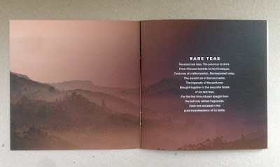
This new collection of colognes is a first in perfumery. Made using fragrance from ultra rare teas grown in the foothills of China to the Himalayas. The ancient art of the tea master is combined with the ingenuity of the perfumer to create these new scents. There are six colognes based on different teas - delicately floral Silver Needle Tea, sparkling and sweet Darjeeling Tea, herbaceous green Jade Leaf Tea, rich and earthy Oolong Tea, deeply seductive Midnight Black Tea and spicy Golden Needle Tea.

This is the promotional brochure produced by Jo Malone. Size is 150mm square and is saddle stitched.

The 4pp cover is on Omnia 280gsm with 12pp text on Omnia 150gsm. The reason that Omnia was chosen is because it would work with the rich detail that is present in the images but that would give a natural look and tactile feel.
Click on images to enlarge
It is printed offset litho in four colour process (CMYK) and as you can see from images, some of the photography is quite dark, but there is no loss of detail, which is what can often happen printing on an uncoated paper, which is why the Omnia was chosen.
Click on images to enlarge
The image below shows the outside back cover printed in solid black and as you can see, the solid looks great...
The image below shows the detail and the way the glass and fine detail has reproduced.
Art direction and design is by the Jo Malone design team. Superb repro, print and finishing is by CPI Colour with Mark Pitman handling the project.

http://www.jomalone.co.uk/rareteas
http://www.cpicolour.co.uk/
 Posted by Justin Hobson 10.05.2017