


You can buy your copy here: http://www.kidswithpuns.com/
http://hatopress.net/
Posted by Justin Hobson 07.03.2017


 Next Thursday, a new book published by Hato Press is being launched at the Whitechapel Gallery. The book is titled Le Théâtre Graphique and is by Sarah Boris. The book takes the form of a large flipbook, Le Théâtre Graphique is an exercise in form and colour, where the theatricality of a rising curtain is reimagined through the performative cycles of nature; night and day, sun and moon, the shifting tide...
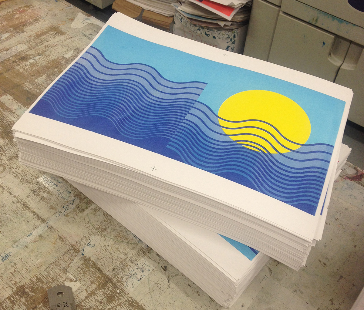


 Kids With Puns is a printed publication which celebrates the humble pun. The magazine is a collaboration between illustrators, artists and designers and showcases a variety of wordplay related work. So if you love puns and visual puns in particular, you'll love this publication.

 |
| Click on images to enlarge |


 Riso or Risograph printing is one of the earliest forms of 'electronic' printing (as opposed to digital). Neither a photocopier or a duplicator, Risography was launched in the mid 1980's and provided a cheap method of colour printing that was cheaper than photocopying for short to medium runs and cheaper than short run offset litho. It was particularly aimed at educational establishments and offices.
 |
| Riso EZ200 model |
 |
| Picture showing the master around the drums |


 This is the new Studio cookbook2, published by East London Riso printer, Hato Press. Studio cookbook1 was a collection of recipes aimed to inspire social lunches at the workplace and included recipes from åbäke, Alex Bettler, Mind Design, Sara De Bondt studio and many more.


 ...and here is the actual publication, edited and produced by Sophie Demay and Charlotte Cheetham, designed by Sophie Demay and Lola Halifa -Legrand. The book is wiro-bound with a red wire and is 190x135mm, portrait. It is printed in 1 colour on a Risograph machine by Hato Press. The materials used are our Colorset Suede, Indigo 270gsm and a wide selection of our other text materials (the beauty of wiro means that you can use many different materials without being limited by producing in 4pp sections).
 ...and here we all are having a jolly time at the viewing!


