Showing posts with label J Thomson Colour Printers. Show all posts

Monday 4 March 2024

Jobs from the past - Number 172

Regular followers of this blog will know that my first post of every month is a "job from the past" so that I can show some of the really good work from years gone by - this project is from nine years ago.

GSA x Drygate 2015

Click on images to enlarge
Drygate Brewing Company is a craft brewery based in the east end of Glasgow and they celebrated their first birthday on May 29th 2015 marking the occasion with a small-batch birthday brew. Working with D8, who had also created the brand identity and packaging for Drygate's core range of beers, they partnered up with graduates of The Glasgow School of Art to create beautiful hand-wrapped, individually designed and signed packaging.
The six Glasgow School of Art alumni are: Fran Caballero; Rae-Yen Song, Isabella Widger, Paul Flynn Brady, Alice Hoskins and Matthew Bainbridge.
D8 worked to create unique packaging that would also reflect Drygate’s philosophy and values. The brewery believes in open, fearless brewing to achieve the exceptional, and the spirit of collaboration has always been one of their main characteristics.
There were 350 editions of six hand-signed artworks. Each is printed offset litho onto our Offenbach Bible 60gsm. The sheets are then hand wrapped around the 750ml bottles, sealed with a branded roundel and a tag held with string is tied to the neck of the bottle to secure the wrap.

The project was featured on the packaging design website the Dieline ...
"The idea is perfect for a birthday beer, allowing beer enthusiasts to open the gift of an amazing brew! The illustrations used on the “wrapping paper” are incredibly special and unique, coming from artists in the community, and they offer variety and individuality among the limited amount of this exclusive libation. The concept can also expand and be used for future brews, utilizing the same bottle style and different artworks, designs, and ideas for the outer wrapping"
http://www.thedieline.com/blog/2015/6/1/drygate-limited-edition-packaging

Offenbach Bible is the perfect paper for this project, as it is light enough to be easily wrapped around a bottle, has an almost 'tissuey' feel and yet prints amazingly.

Creative direction and design is by D8 and the project was handled by Stephen Cappello. The bottle wraps are printed by J Thomson Colour printers, based in Glasgow.

All in all this is a most engaging piece of branding and packaging. A superb creative solution, beautifully executed and printed.

https://drygate.com/
https://d8.uk/
https://www.gsa.ac.uk/
https://www.jtcp.co.uk/
Posted by Justin Hobson 04.03.24

Wednesday 15 February 2017

Edinburgh Napier University 2017 Prospectus

Edinburgh Napier University is home to over 19,500 students from over 140 countries. Established in 1964, Napier now boasts six specialist schools, each an impressive institution in its own right, with world-class facilities, academics, researchers and international links.
 
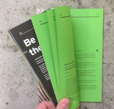
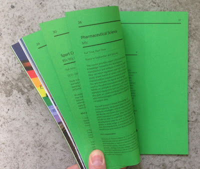
This article is about the nine individual prospectuses they have produced for the 2017 academic year, each one for a separate school or course selection and each of these books is very special indeed!
Click on images to enlarge
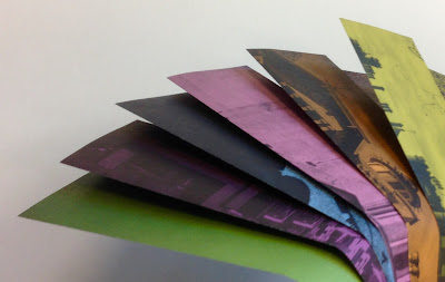
...as each of the books has a section with all the course information printed on a different colour of our Colorset 100% Recycled text, as you can see from the images below:
The books are all 235x165mm, which is an economical format on a B1 press using B1 size paper. They are portrait and are perfect bound. The prospectuses vary in pages from 50pp up to 82pp using a mixture of 115gsm uncoated offset paper printed litho in CMYK and Colorset in one colour litho (black)
Computing - Colorset Lemon
Engineering & the Built Environment - Colorset Lime
Criminology, Psycology & Law - Colorset Light Grey

Tourism - Colorset Mango
Business & Languages - Colorset Acquamarine
Arts & Media - Colorset Solar

Design - Colorset Pink Ice
Health & Social Care - Colorset Light Blue
Life & Sport Sciences - Colorset Spring Green
So what we have here is a really special collection of prospectus books. The self coloured text pages make each individual book clear and engaging - giving power and clarity to the text.
The books are all perfect bound (it's not possible to section sew with the variables in the quantity of pages)
Art direction and design is by the Marketing, Brand and Communication Department at Edinburgh Napier University.

Print and production is by J. Thomson Colour Printers in Glasgow and they have made a superb job of both the print and finishing.

http://www.napier.ac.uk/
Posted by Justin Hobson 15.02.2017

Friday 29 April 2016

Architect IPA

This is a good post for the Friday before a Bank Holiday weekend ..it's about beer! The Architect IPA is a limited edition Festival ale celebrating six of Glasgows most notable architects of the past, is brewed especially for the Scottish Festival of Architecture.

The Festival is a major, year-long, Scotland-wide celebration led by The Royal Incorporation of Architects in Scotland which brings Scottish architecture to life and is a key part of the 2016 Year of Innovation, Architecture and Design. The Festival of Architecture 2016 is designed to be an engaging, inclusive and Scotland-wide celebration. The Festival is a partnership of over one hundred organisations, a nationwide event that will show how architecture touches everyone’s lives. This truly global Festival is designed to reach out to the broadest audience – local, national and international.
Produced in collaboration with Drygate and Graphical House the Architect IPA is a limited edition Festival ale celebrating six of Glasgows most notable architects of the past. Alexander 'Greek' Thomson, Charles Rennie Mackintosh, Gillespie Kidd and Coia, Basil Spence, Robert Adam and Honeyman and Keppie were selected through a public vote and the work of each architect has inspired the Architect IPA labels and wraps.
The Architect IPA will be sold from the specially designed Architect Bar. A pop-up bar design which has been informed through in-depth research of the Glasgow pub typology, and its development through the years. The Architect IPA will be available at events throughout the Festival which celebrate the work and themes of each of the selected architects.
Click on images to enlarge
The size of the wraps is 190x270mm, a flap folding over to make the finished size of 136x270mm. On the reverse side of the wraps is a biography about each of the architects. A well written, interesting and useful addition to a beer label.
Each is printed offset litho onto our Offenbach Bible 60gsm. The sheets are then hand wrapped and affixed around the 750ml bottles.
Offenbach Bible is the perfect paper for this project, as it is light enough to be easily wrapped around a bottle, has an almost 'tissuey' feel and yet prints amazingly. The wraps are printed offset litho in CMYK.
Here they are in all their glory... 
The ale was launched last month (17th March) at this launch event.
Design and Art direction is by Graphical House, based in Glasgow and the creative director is Colin Raeburn. Superb printing is by J. Thompson Colour Printers in Glasgow.
A wonderful beery way to start the weekend ...!

Posted by Justin Hobson 29.04.2016

Monday 22 June 2015

Drygate Brewing Company - Limited Edition Packaging

Click on images to enlarge
This is one of the most innovative and beautiful projects to have appeared on the blog so far this year ...in my opinion!

Drygate Brewing Company is a new craft brewery based in the east end of Glasgow and they celebrated their first birthday on May 29th, marking the occasion with a small-batch birthday brew. Working with D8, who had also created the brand identity and packaging for Drygate's core range of beers, they partnered up with graduates of The Glasgow School of Art to create beautiful hand-wrapped, individually designed and signed packaging.
The six Glasgow School of Art alumni are: Fran Caballero; Rae-Yen Song, Isabella Widger, Paul Flynn Brady, Alice Hoskins and Matthew Bainbridge.
D8 worked to create unique packaging that would also reflect Drygate’s philosophy and values. The brewery believes in open, fearless brewing to achieve the exceptional, and the spirit of collaboration has always been one of their main characteristics.
There are 350 editions of six hand-signed artworks. Each is printed offset litho onto our Offenbach Bible 60gsm. The sheets are then hand wrapped around the 750ml bottles, sealed with a branded roundel and a tag held with string is tied to the neck of the bottle to secure the wrap.

As the review on the packaging design website the Dieline reports...
"The idea is perfect for a birthday beer, allowing beer enthusiasts to open the gift of an amazing brew! The illustrations used on the “wrapping paper” are incredibly special and unique, coming from artists in the community, and they offer variety and individuality among the limited amount of this exclusive libation. The concept can also expand and be used for future brews, utilizing the same bottle style and different artworks, designs, and ideas for the outer wrapping"
http://www.thedieline.com/blog/2015/6/1/drygate-limited-edition-packaging

Offenbach Bible is the perfect paper for this project, as it is light enough to be easily wrapped around a bottle, has an almost 'tissuey' feel and yet prints amazingly.

Creative direction and design is by D8 and the project was handled by Stephen Cappello. The bottle wraps are printed by J Thomson Colour printers, based in Glasgow.

All in all this is a most engaging piece of branding and packaging. A superb creative solution, beautifully executed and printed.

http://drygate.com/
http://d8.uk/
http://www.gsa.ac.uk/
http://www.jtcp.co.uk/
Posted by Justin Hobson 22.06.2015