Monday 6 July 2009

Job from the past...

This is a superb piece of literature produced in 2002 by silkscreen printer and "boutique production house" Artomatic.

"ilikeprinting" is the the name of this innovative art/design/publishing project. Essentially it is a series of original screenprints which celebrate the culture of printed graphics and the talents of graphics artists from around the world. The prints were sold, either individually or as a boxed set and this was the accompanying book or literature that was published with the prints.  

The size of the book is 210x148mm, portrait. It has a 4pp cover and 64pp text printed on Optimale Blanc Naturel 250gsm and 140gsm. The 8pp dustjacket is silkscreened one colour on Wibalin book covering paper.

The text is all printed in one colour - and here's the tricksy bit - facsimiles of all the artworks have been litho printed on coated gloss paper and are individually "tipped in" on each right hand page. as you can see...
Electro-luminescent Car Component off/on by GTF
Currency by Tom Hingston & Robert Del Naja
Untitled by KAWS
Radioaktivtat by Mason Wells
There are 29 artworks in total, all exceptionally good - I wish I could show them all here. I can't, so you'll just have to look at the list of participants as reproduced on the outside cover.
8pp dustjacket wraps around the cover like so....
A really interesting (and important) point of note is the binding. Because the pieces were being stuck in to the book it could have created an ugly bulging where the eneveness in the text area would have made it look unsightly. So to get round this problem, they employed a technique called "guard binding" or "binding with a guard" which is the same method used for traditional photo albums: 
As you can see from the pic above, it is "section sewn" but has a "guard", which is a full height but narrow width slip of material interleaved between each of the pages, thereby bulking out the spine. Smart thinking and it maitained the overall excellent appearance of the book.

So who and what were Artomatic? Their roots were as a silkscreen printer founded by Tim Milne in 1982 who then branched out into print and production management specialising in creatively driven projects. In the early 2000's they took a space with a shop front in the trendy Great Sutton Street in Clerkenwell and set up a "print library" with examples of materials, processes and file copies and a gallery space. Design companies signed up (and paid) to become members and in 2001, the figure of signed up members was around 450. There was a real buzz and a great sense of excitement and there was some excellent talent there. Robert Gaddie and Daniel Mason (both of whom I still work with) were both at Artomatic.
Artomatic was definitely ahead of it's time. Heidi Lightfoot (then a director at Trickett & Webb) described their position in the market as "unique" in an article that appeared in DesignWeek in 23.01.2003 and reproduced in Printing World on 10.02.2003. Tim Milne proudly announced that "Artomatic is in a position to bring aspects of such jobs, the same level of understanding that is put into branding aspects. We have something to say to the industry and the world would be a poorer place without us." Sadly, later that year they went bust and ceased trading. The shop closed and some of the library was bought by Gavin Martin for their PrintLounge concept.

Most people will remember Artomatic with great affection (...although not George Fearnley from Longford Press who wrote to Printing World bemoaning the loss of £54,000 when Artomatic went into liquidation!) They genuinely were a very forward thinking organisation with great ideas and a real drive to make print special. It was a shame that they did not survive. The last I heard of Tim was that he moved to New York.
Posted by Justin Hobson 06.07.2009

Wednesday 1 July 2009

Thank You's

It's always nice to receive a "thank you" - and this one was especially nice. I had sent some copies of Size, Format, Stock to Chris Clarke who also lectures part time, and he sent me this very lovely limited edition postcard. I've got 46 out of 300. www.chris-clarke.co.uk


Tuesday 30 June 2009

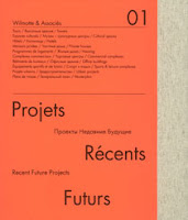
Recent Future Projects 01

This is an amazing book produced for international architects Wilmotte & Associés. The firm was set up in Paris in 1975 by Jean-Michel Wilmotte and their practice now spans the globe. The content is self explanatory under the title, Recent Future Projects.

The size of the book is 280x235mm, portrait and is casebound. The 232pp text is made up using "French-folded" sections (this is where the folded edges are on the foredge of the book) on Offenbach Bible 60gsm which gives it a sensational light feel and flows beautifully in the hand. This is complimented by the lighter than usual boards used to make the case which means it has a nice flexible feel. The book has a 20mm spine.
The print result on the Offenbach Bible is simply stunning. The fluorescent orange used on the cover and on 8 dividers in the book which are printed on a coated paper prints equally well on the Offenbach Bible 60gsm! The images, whether CGI's or the very detailed mono photography looks amazing.
The text sections all "French Folded".- this is where the folded edges are on the foredge of the book, as in the picture below:
Of course 'french - folding' uses more paper - in fact double the amount! - so this job is actually in conventional terms a 232pp text, which is actually 116x 4pp French folded sections, so in actuality its 464pp!

The book is printed by a London printer, Push. The print and binding is superb on this book. It is printed CMYK throughout but many of the images have a mono reproduction with an integrated silver - which is hard to show in these pictures....
The above detail image shows the silver printed on Offenbach Bible and it really does look like a metallic silver, not just a grey shade which is what can happen on uncoated papers.

It's hard enough to get the consistency of look and feel in one publication for mono images but to add into the equation printing silver on uncoated (and in 60gsm) is quite something! - not to mention fluorescent orange also on Offenbach Bible 60gsm!

Design is by Studio Fernando Gutiérrez based in London. Creative Director is Fernando Gutiérrez. This is an amazing book and a truly amazing piece of print and finishing. Other architectural firms can only aspire to create literature as good as this

http://www.wilmotte.fr/
http://www.fernandogutierrez.co.uk/
http://www.push-print.com/
Posted by Justin Hobson 30.06 2009

Thursday 25 June 2009

It's nice that

http://www.itsnicethat.com/ is a blog set up by Will Hudson and Alex Bec and I'm sure will be familiar to many of you. This blog is particularly unusual because they created a physical incarnation - yes, it became a printed book - ON PAPER!

I just received an e-mail update from them and they have sold all the copies in less than a couple of months - so well done to them - hopefully this demonstrates that good quality print is not a dead medium and is still very much alive - can't wait until the next one!

The paper used is Colorset Ash 270gsm for the cover and the text is printed on Redeem 100% Recycled 100gsm. Print is by Push (http://www.push-print.com/)

Monday 22 June 2009

Sewing on paper

I got a call from Sandy Suffield a couple of months ago. I used to work with Sandy many years ago when she worked on John Rushworth's team at Pentagram in the late 90's/early 00's and since then she's been at various places including Time Out and has spent the last four years in the US. Anyway she revealed that one of her hobbies is sewing on paper - check these out...

Now most people assume that if the word sewn is used in the context of paper, that you're referring to some binding method - well not in this case! Sandy actually stitches into the paper to create these amazing artworks. The pictures speak for themselves. I think they're incredible - and now for the paper plug - they're all on our recycled Colorset 120gsm!


http://fionawoodcock.com/

http://therowanartsproject.com.contentcurator.net/?location_id=196

Friday 19 June 2009

Education Education Education!

I just received some copies of a really nice brochure from Paul Spencer at Found Design. The client is Shepheard Epstein Hunter and showcases their work for the education sector. Really lovely print job by Orchid Print on Omnia and finished beautifully. Saddle stitched and then glued into cover with freestanding spine - simple but very effective solution when well finished.


...and it's always lovely when an appreciative little note arrives with it as well! -thanks Paul


Saturday 13 June 2009

This is Paper Art

This is the most amazing thank you card (piece of paper) that I've ever been sent!

Eng Su, has just left NB:Studio to go freelance, sent me this most amazing piece. All the letters have been cut out by hand with a scalpel - and not just out of any old paper - Eng has used our Offenbach Bible 50gsm!

Interestingly this is a useful piece to dismiss one of the commonly held beliefs about the Offenbach Bible which is that because it is thin, it will tear easily. What people forget is that this is a GENUINE "Bible" paper (we supply it to Bible publishers) and it has three imperatives:

1. High opacity for it's weight
2. Archival quality (in excess of 100 years)
3. Excellent strength, so it can be used on a daily basis!

Needless to say this fabulous piece will be going in a frame on the wall in the office.

Thank you Eng and good luck in finding the freelance work!