Tuesday 17 July 2012

Penthouse - Wellington House

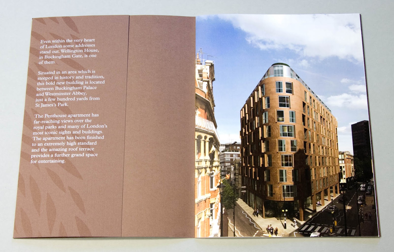
Wellington House in Buckingham Gate, London SW1 is one of London's most prestigious addresses. This is the literature especially commissioned to sell the penthouse appartment (which, incidentally, comes with the roof terrace!)

The cover which is litho printed with leaf illustrations and hot foil blocked in silver and white foil uses a linen embossed brown board supplied by that other, Hull based, paper company! Size is 190x265mm portrait and is saddle stitched.
However, it's the text where the job really starts to shine! ...printed on our Omnia 150gsm.
Centre spread:
Interestingly, the brochure only has a 4pp text stitched in, with the 6pp "plans" section forming a roll fold which has been stuck into the inside back cover using a tab stuck parallel to the spine (below)

...rolling out to it's full extent:


Design is by NB:Studio. Creative Directors on the project were Nick Finney and Alan Dye. Designer was Eng Su. It has been beautifully printed, foiled and finished by Gavin Martin.

Posted by Justin Hobson 17.07.2012

Monday 16 July 2012

Takeo

It was with interest that I read last week in Printweek about the new range of Japanese papers from Takeo, which is being stocked by the other, Hull based paper merchant (...you know who!)

http://www.printweek.com/bulletin/printweekdailybulletin/article/1140982/gfsmith-launches-takeo-range-uk/

Takeo are the market leading, creative paper merchant (they aren't a manufacturer) based in Japan and throughout Asia. It was in the summer of 2008 when Mr. Sakuma from Takeo first visited us in Tonbridge and I was happy to share whatever market information with him that I could offer. At that time (before the financial crisis) their plans were to establish their own distribution outlets in London, Paris and Milan. Although followed with a further visit in 2009, it was obvious that with the global situation and the extraordinarily high Yen exchange rate that their European plans were shelved.

They have a lovely range of papers and it's good to see that some of them, including the highly unusual Pachica, will now be available in the UK. Presumably if all goes well, they'll be able to establish their own warehouses in Europe and offer their full range - which believe it or not is a massive 9,400 items!

www.takeo.jp
http://www.takeo.co.jp/site/english/products/finepapers/index.html
Posted by Justin Hobson 16.07.2012

P.S. After the 2011 Earthquake and Tsunami in Japan, I wrote to Takeo offering our condolencies and was pleased to receive a personally written letter from President and CEO,Mr Shigeru Takeo, thanking me and advising me that there had been no life threatening injuries sustained.

We helped sponsor a poster to raise funds for the relief effort:
 http://justinsamazingworldatfennerpaper.blogspot.co.uk/2011/03/japanese-earthquake-charity-poster-sold.html

Friday 13 July 2012

Fashion Rations 2

A couple of years ago, fashion retailer Whistles, started an internal communication/employee loyalty scheme where staff members can offer a limited  discount to "friends and family". They coined the phrase "fashion rations" and produced ration book style booklets in a small "ladies purse" size. This is the latest incarnation, which is "more fashiony and less rationy" if you get what I mean - much brighter and less utility looking:

As with previous editions, a particularly nice touch is that the front of all the books are "crash numbered" on the covers (see above). For those of you who aren't aware of this process, it is an old letterpress process which uses a numbering box on a platten. It is an "impact" process which simply thumps the number on the sheet and then (in a clockwork style) clicks on one digit. It allows a degree of security and control on how many books are issued.

The size of the book is A7 (105x74mm) portrait and is stab stitched (that's where the staple goes through the whole book, from front to back - like a cheque book - although the term cheque book binding normally implies, the application of binding tape over the stab stitches).

The cover is on our Colorset (100% recycled) in Magenta 270gsm. The book includes 5 vouchers or "rations", which are perforated along the spine, so they tear out easily.
...and of course, there's always the small print on the reverse!

Print production was done by PrintStation, based in Bexhill on Sea (guy@print-station.biz).

The job was designed at Whistles by Jess Schiazza ... and thank you Jess for sending me a copy and the lovely note.

...and if you're interested, here's the post about the first ration book: http://justinsamazingworldatfennerpaper.blogspot.co.uk/2009/11/fashion-rations.html

http://www.whistles.co.uk/
http://printstationltd.co.uk/
Posted by Justin Hobson 13.07.2012

Wednesday 11 July 2012

Preen Line S/S 2012

This is the Spring/Summer 2012 look book for Preen Line, which is the "contemporary line" range with the lower price tag from London fashion house PREEN.

It's a lovely oversize 240x335mm, portrait, saddle stitched format. It's interesting and worth pointing out that this is actually a "self cover" job - but certainly doesn't feel like it - it feels really substantial. A big part of that is the format and the fact that it is printed on our Omnia 150gsm, which has a high bulk. It's also worth mentioning that as the whole job is a 32pp self cover, it's actually an economical format - the whole job being printed up on two sheets of B1.


As you can see from the above images above, there is lots of colour and blue is prevalent - and it just looks beautiful on the Omnia - no mottle - just gorgeously even blue areas (and we all know that blue can be a problem!)  Even the images with CMYK dark areas - with loads of ink going down, looks great on the Omnia, reproducing bright vibrant colours as well and the dark mono images as well, whilst retaining all the detail.


Detail of credit page on the outside back cover: 

The art direction is by Mark and Chris Thomson and the quality of the direction and photography (by Nick Dorey) is matched by the exceptional print by Push.

http://www.preen.eu/
http://www.studiothomson.com/
http://www.push-print.com/
Posted by Justin Hobson 11.07.2012


Monday 9 July 2012

ROOFLIFE!

On Friday evening, I was lucky enough to go to a party hosted by Haptic Architects and BOB Design. The event was part of the London Festival of Architecture on 6 &7 July 2012.

ROOFLIFE! SPECULATING ON LONDON'S UNDERUSED ROOFTOPS... An installation and event that speculates on the future of London's Rooftops. The event was held on the rooftop of the Islington studio space that they share, taking in 360 degree views of the London skyline and across the Kings Cross area in particular.


An amazing rooftop garden was created together with a scafolding skeleton (in case of rain) and "crow's nest" for the DJ (see below).
The views are spectacular, as you can see from my pic below of The Shard, which had been officially opened, the previous evening.
The garden was created by Ian Jackson Landscape Architecture and Holmes & Sons and contained 34 different herbs, fruits and vegtables, some of which were suitable for using to mix with the drinks! The pic on the right shows the beautiful signage.
The picture below shows the display in the studio which invites you to look through the peepholes and see the various well known landmarks:
...and the guide of all 34 herbs, vegtable and fruits were printed on a lovely long list 1000mm x 100mm, on our Offenbach Bible 60gsm!
Thanks to BOB Design and Haptic for inviting me and for a great party.
Posted by Justin Hobson 09.07.2012

Thursday 5 July 2012

Leisure Plan

This is a press pack produced for Leisure Plan’s exclusive portfolio of luxury outdoor furniture. They specialise in modern, designer-led furniture including Dedon, Ego Paris and Fischer Möbel. This pack is to announce to the press and trade stockists that these three brands are now exclusively available from Leisure Plan.

The pack consists of four A5 cards, printed offset litho on our Omnia 320gsm in two colours - red and black, with the images produced as halftones only which works really well with Omnia with it's matt flat nature. The cards are held together with a 40mm wide belly band which is simply foiled with the logos of the three manufacturers on Colorset Nero 120gsm - very simple and effective

Below image shows the detail of the Ego Paris card:
Design brothers Cai and Kyn were comissioned to design and produce the pack and thanks to them for sending me a file copy:
Repro, print and finishing is by Kent based Zone Graphics .

www.leisureplan.co.uk
http://www.caiandkyn.co.uk/
www.zonegraphics.co.uk
Posted by Justin Hobson 05.07.2012

Tuesday 3 July 2012

Jobs from the past - Number 33

Regular followers of this blog will know that my first post of every month is a "job from the past" so that I can show some of the really good work from years gone by...

...and being jubilee year, it seems like a good time to write about this one!

Lightness of Being 2008 - Chris Levine
Chris Levine is a Canadian born light artist who studied at Chelsea School of Art and Central St Martins and this is the invitation and show catalogue for his 2008 show held at the Old Truman Brewery in March 2008.
The centrepiece of the show is Chris’s (now, well known) work "Equanimity", the historic hologram portrait of Queen Elizabeth II (above) commissioned by the Island of Jersey to commemorate 800 years of allegiance to the crown and reputedly the only "portrait" of Her Majesty with her eyes closed. Equanimity 9, is pictured below:

The catalogue and invitation are pictured below. Catalogue is left, invite on the right. The invitation and cover of the catalogue are both printed on Astralux [1 sided] 250gsm which is a "cast coated" board (high gloss one side, uncoated reverse). Gloss coated side is printed in a fluoro pink solid. The invitation is printed CMYK on the outside (uncoated) with the coated (fluoro) on inside...
If you click on the image above, to enlarge, you'll see that the catalogue cover - which is an 8pp cover with the flaps reverse folded so they are on the outside - has a fantastic embossing - which shows the Equanimity image in relief. It just looks fantastic.

Size of both the invitation and the catalogue are A5, portrait. The catalogue is perfect bound with a 36pp text printed on our Neptune Unique FSC 160gsm.Text is printed four colour plus fluoro pink throughout.
Catalogue, invitation and graphics are by Why Not Asscociates. Print is by Push.

This is simply the most innovative use of Astralux as a cover material that I have seen - the way the invitation and catalogue cover switch inside and outside and switch processes is superb and compliments the subject - as it should!

http://www.chrislevine.com/
http://www.push-print.com/
http://www.whynotassociates.com/
Posted by Justin Hobson 03.07.2012