Friday 8 September 2017

New Colorset Swatch

Many of you will know that a couple of years ago we started to bring in our Colorset range in 350gsm, so we now have ALL colours in 120gsm, 270gsm and 350gsm - all in B1 size (700x1000mm).
For those of you not familiar with Colorset, it is our range of coloured text and cover papers which is 100% recycled and more competitively priced than some other well known brands of coloured paper! Below is the updated swatch: 
The Colorset brand identity and swatch design was created by The Chase, some years ago but it's still going strong! Creative director on the project was Harriet Devoy and the designer was Monica Pirovano.

There are now 28 colours (including black and white) and two new shades, Chilli and Orchid -see image below
If you would like the updated swatch, please drop me an email and I'll pop one in the post
justin@fennerpaper.co.uk
Posted by Justin Hobson 08.09.2017

Tuesday 5 September 2017

The Wardian

Wardian London is a residential-led development under construction on the Isle of Dogs, London from Eco World-Ballymore and designed by architect firm Glenn Howells. The scheme consists of two skyscrapers and groundworks were started in 2015. Upon completion, expected to be in 2019, Wardian London will be one of the tallest residential developments in London and the UK.

This property brochure is not really a brochure at all - it is an amazingly produced, sumptuous case-bound book.

The size of the book is 320x245mm, portrait. It is case-bound with an 18mm spine and the text is section sewn 
 
The introduction 'flysheet' is actually a series of flysheets or end-papers, setting the scene of this development where each apartment has it's own 'sky garden' and the emphasis is on plants and the seasons.
There are 8pp of these flysheets/end-papers in both the front and back and they are printed on our lovely Offenbach Bible 60gsm  - just look at the print result, it's truly amazing, just remember this is a 60gsm sheet of uncoated paper! ...it just feels beautiful.
The majority of this 126pp book is printed on our Omnia 120gsm.The reason that Omnia was chosen is because it would beautifully reproduce the photography with the rich greens of the gardens, solid colours and dark photography and most importantly feel special - with the reproduction that you would expect on a silk or gloss but with a natural tactile uncoated feel.
Click on images to enlarge
There are six chapters within the book. Each of the chapters is preceded by a 'tip in' featuring a pen and ink illustrations of the type of plants studied by Nathaniel Ward after whom the development is named.
The size of the 'tip in' is 230x162mm and printed on our Astralux 90gsm which is a 1 sided cast coated paper. The illustration is printed on the uncoated side with the credit being printed in one colour on the reverse (glossy) side.
Throughout the publication there are 14 half pages which are 162mm wide. The dividers highlight particular features of the development as you can see below...
Click on images to enlarge
The below image shows the half page titled 'Natural Fragrances'. As you can see the half pages sit in these wonderfully luxurious spreads without disruption, they enhance the experience for the reader.
 The book is printed Offset litho throughout in CMYK plus a metallic gold pantone 'special' ink. This is the other very good reason that Omnia was chosen for this project. On most traditional uncoated papers, metallic inks can look flat and gold can just look a bit brown, but as I hope the below image demonstrates, the metallic gold type really does look metallic on Omnia.

Another feature is the use of gloss UV varnish. Unlike most uncoated products, you can successfully gloss UV varnish on Omnia (with a single hit) and it works really well - as you can see in the below pic...
This is a very effective and subtle use of gloss UV varnish.
For the floorplans there is also a 'throw- out'. Printed solid black plus the metallic gold keylines and type.
Click on images to enlarge
The book is beautifully bound, section sewn and neat black headbands and a divider ribbon.
Click on images to enlarge
This is an exquisitely produced book which using a great choice of materials does convey all the special features and luxury that this development offers. Design is by Made Thought.

Print production is by Push based in London. The quality of reproduction on the different materials and the excellent binding and attention to detail has simply got to be seen to be believed, it is a truly stunning job.

I'm sure that you can tell from the way that I've written about this project that this really is a special piece of print - it's one of those rare projects where all those elements that go into producing a piece of literature (concept/design/illustration/photography/print/paper/finishing etc) come together and combine to produce the most superlative result.
http://www.push-print.com/
Posted by Justin Hobson 05.09.2017

Friday 1 September 2017

Jobs from the past - Number 95

Regular followers of this blog will know that my first post of every month is a "job from the past" so that I can show some of the really good work from years gone by...

Boots Company Report and Accounts 1997
I was reminded about this project from twenty years ago as this project uses paper made at the Curtis Fine Paper, Guardbridge Paper Mill, which has since closed and now houses the Eden Mill brewery and distillery, which I wrote about below.

Up until the early 2000's the design and printing of company annual report and accounts was VERY big business. In the burgeoning design market of the 1980's and 90's There were many design companies which specialised in just annual reports (the likes of Michael Peter, Bamber Forsyth, Benjamin Rowntree, Radley Yeldar etc) and printers who would specialise in printing them such as Greenaway Harrison, Litho-Tech, Oakley Press, White Dove etc.

Back in those dim and distant days, it was very common for Annual Reports to be divided into the Report - printed on a white paper, printed in four colour process (with photographs!) and the Accounts section - printed on a coloured paper ...and this job follows that pattern.

This is the Report and Accounts for the Boots Company, the group of companies based on the Nottingham chemists founded in 1849 by John Boot. Back in 1997 they were a PLC in the FTSE 100, however ten years ago they were bought by a private equity firm based in Switzerland. The design is by Addison and the printer was Litho-Tech.

The size of the report is 297x180mm, portrait. It has a 4pp cover, which is printed in a blue and is matt laminated.
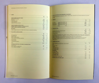
Below you can see the split between the two sections.
According to my notes, the 36pp front 'report' section was printed on Zanders Megamatt 150gsm, printed in CMYK, possibly with a special and a 'spot gloss machine varnish' which was a highly desirable effect back in those days.
The 44pp 'accounts' section is where I came in! I was briefed by Karen Blades, Production Manager at Addison to provide a bespoke paper to what was described as a 'post it note yellow' shade, which as you can see from the result below, we managed to achieve.
Click on images to enlarge
We decided to work with Curtis Fine Paper, who at the time had two paper mills in Scotland, one at Dalmore and one at Guardbridge, previously they were know as GB Paper. I sent the mill a sample of the colour and the received a couple of 'lab samples' made in the technical department at the mill. These were then forwarded to Addison and eventually to the end client for approval. I've written about what a mill making is here:
https://justinsamazingworldatfennerpaper.blogspot.co.uk/2015/10/what-is-mill-making.html

In this instance, the mill agreed to make a 2 tonne trial so a small group went to the mill to see the paper as it was being made. This was pretty unusual even in those days! ...so I visited the Guardbridge mill accompanied by Karen Blades from Addison and Derek Adnitt and Les Baker from Litho-Tech printers. As a result we were able to show the client EXACTLY the paper they were getting.

After that trial, Boots were shown the paper, it was approved and then the mill manufactured the remainder of the paper.
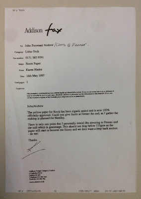
 - and back in those days everything was done by fax and fortunately I still have the fax in my archive with the approval...

Click on images to enlarge
The printers called Litho-Tech were based in Kennington, London who at the time was one of the leading corporate printers in London if not the UK. Sadly like many printers of that era, the company no longer exists. It was printed offset litho. My notes aren't completely clear but I recall it was about 16 tonnes . Derek Adnitt was the sales director, Les Baker, the production manager and Paul Watson the Managing Director. Here are the credits which are in the back of the report.
Karen Blades now works at Print Source UK and still spends her time producing quality annual reports!

...a real trip down memory lane!

http://www.boots.com/
https://www.addison-group.net/
Posted by Justin Hobson 01.09.2017

Thursday 31 August 2017

Eden Mill

Last week I was in Scotland on holiday and visited St Andrews. We were booked onto a gin tasting tour at Eden Mill and was surprised when we arrived that the distillery and brewery is actually in the the former Guardbridge Paper Mill, which until 2008 many of you would have known as Curtis Fine Paper.
The Fife-based Eden Brewery became Scotland’s first combined brewery and distillery in 2014, when they branched out into making Scotch Whisky and Gin. The move also represented a slight twist in history as before becoming the Guardbridge mill making paper, the mill was a distillery owned by the Haig family, called the Seggie Distillery between 1810 and 1860.

Guardbridge Paper Mill - early 20th century?
The former paper mill buildings which now house the Eden Mill Distillery and Brewery.
The mill clock, which still works...
Inside the distillery, the former paper mill offices are now tasting rooms and administration offices.
Many of the original mill fittings and fixtures in this listed building are still in place.
As Scotland's first single-site distillery and brewery, making gin, whisky and beer, Eden Mill spirit is created by distillers in copper pot-stills and exhibits a wide range of flavours from botanicals sourced from the local area, as well as from around the world - and I tasted all of them, courtesy of our excellent and knowledgeable guide.
I've previously written about other paper mills which are now being used for other uses, including one owned by Google as a data centre:

..and one used as a shopping centre:
https://justinsamazingworldatfennerpaper.blogspot.co.uk/2014/03/from-paper-mill-to-shopping-mall.html

I hope Eden Mills continues to expand and utilise more of the former mill site ...just so long as they can retain their craft heritage and hand made ethos.
https://www.edenmill.com/
Posted by Justin Hobson 31.08.2017
 
...the last time I visited Curtis Fine Papers, Guardbridge Mill was in 1997 to see the paper being made for the Boots annual report, which I shall write about on my next "job from the past" post tomorrow! 


Monday 28 August 2017

Caramel Spring/Summer 17

Eva Karayiannis, founded Caramel in 1999. Originally from Greece, she came to London to study the history of Art at Sotheby's, eventually establishing a business selling and ultimately designing children's clothes. Caramel is known for its fresh silhouettes, distinctive colour ways and intricate attention to detail.
 
This is the look-book for the Spring Sumer collection. The format is a very simple 16pp broadsheet, which opens easily to read and displays a large poster type area, when fully open.
Size is 594mm x 420mm  folding to 210x148mm. The birds eye view below should give you the best idea of the format and the way it works.
The paper chosen is our Omnia Natural 120gsm because it would work with the intricate detail that is present in the images but that would give a natural look and tactile feel. It is printed offset litho in four colour process (CMYK) and as you can see from images, some of the images have dark areas, but there is no loss of detail, which is what can often happen printing on an uncoated paper. The neutral shade of the Omnia Natural works just right with these images.

Outside spreads folded out
Click on images to enlarge
Inside spread, folded out flat:
It is printed offset litho in four colour process (CMYK) and as you can see from the spreads, some of the images have dark areas, but there is no loss of detail, which is what can often happen printing on an uncoated paper. The neutral shade of the Omnia Natural works exceptionally well with these images. The below image demonstrates the amount of detail that is retained in the shirt and the vibrant colours.
Art direction and design is by the in-house studio at Caramel based in London.  Printing is by Gemini Print, based in Brighton.

http://www.caramel-shop.co.uk/
http://gemini-print.co.uk/
Posted by Justin Hobson 28.08.2017

Thursday 24 August 2017

It's a wrap!

‘FORGETTABOUT IT’ is American artist Joyce Pensato’s second exhibition with Lisson Gallery and was shown this summer. This is the 142 page hardback book published to coincide with the exhibition. Featuring an entirely new body of work, encompassing large-scale paintings, drawings and a site-specific wallpaper installation, this catalogue is a survey of Pensato’s collaboration with Lisson Gallery over the last three years.
Size of the book is 290x245mm, portrait and it has a 'bookjacket' printed on our wonderfully lightweight Offenbach Bible 60gsm.
...except this is no ordinary 'bookjacket' as it folds out further to reveal a complete artwork at a size of  560x 910mm.  
Click on images to enlarge
Printed one side only, offset litho in CMYK and hot foil blocked in metallic gold foil, you can see detail of the foiling below:
Catalogue is published by the Lisson Gallery. Edited by Louise Hayward and Ossian Ward. Design is by Zoë Anspach.
Print is by Pureprint.

http://www.lissongallery.com/artists/joyce-pensato
http://www.pureprint.com/
Posted by Justin Hobson 24.08.2017